
Introduction
Summary: If you are using a scatter plot to compare two datasets, rotate your data.
Three times in the last six months I’ve explained to different colleagues and former colleagues what a Bland-Altman (BA) plot is. Admittedly, the last of those explanations was because I remarked to a colleague that I’d been talking about BA-plots and they then wanted to know what they were.
BA-plots are a really simple idea. I like them because they highlight how a human’s ability to perceive patterns in data can be markedly affected by relatively small changes in how that data is presented; rotating the data in this case.
I also like them because they are from the statisticians Martin Bland and Doug Altman who produced a well-known series of short articles, “Statistics Notes”, in the BMJ in the 1990s. Each article focused on a simple, basic, but very important statistical concept. The series ran over nearly 70 articles and the idea was to explain to a medical audience about ‘statistical thinking’. You can find the articles at Martin Bland’s website here. Interestingly, BA-plots were not actually part of this series of BMJ articles as their work on BA-plots had been published in earlier articles. However, I’d still thoroughly recommend having a browse of the BMJ series.
Since I’ve had to explain BA-plots three times recently, I thought I’d give it another go in a blogpost. Also, inspired by the Bland-Altman series, I’m going to attempt a series of 10 or so short blogposts on simple, basic Data Science techniques and concepts that I find useful and/or interesting. The main criterion for inclusion in my series is whether I think I can explain it in a short post, not whether I think it is important.
What is a Bland-Altman plot?
BA-plots are used for comparing similar sets of data. The original use-case was to test how reproducible a process was. Take two samples of data that ideally you would want to be identical and compare them using a BA plot. This could be comparing clinical measurements made by two different clinicians across the same set of patients. What we want to know is how reproducible is a clinical measurement if made by two different clinicians.
Perhaps the first way of visually comparing two datasets on the same objects would be to just do a scatter plot – one dataset values on the x-axis, the other dataset values on the y-axis. I’ve got an example in the plot below. In fact, I’ve taken this data from Bland and Altman’s original 1986 Lancet paper. You can see the plotted points are pretty close to the 45-degree line (shown as a black dashed line), indicating the two datasets are measuring the same thing with some scatter, perhaps due to measurement error.

Now, here’s the neat idea. I can do exactly the same plot, but I’m just going to rotate it clockwise by 45-degrees. A little bit of high-school/college linear algebra will convince you that I can do that by creating two new features,


Here 


Now we plot 

Now a couple of things become clearer. Firstly,
What the eye doesn’t see
What I really like about BA-plots though, is how much easier I find it to pick out if there is any systematic pattern to the differences between the two datasets. I haven’t looked into the psychological theory of visual perception, but it makes sense to me that humans would find it easier looking for differences as we move our eyes across one dimension – the horizontal axis – compared to moving our eyes across two dimensions – both the horizontal and vertical axes – when trying to scan the 45-degree line.
I first encountered BA-plots 25 years ago in the domain of microarray analysis. In that domain they were referred to as MA-plots (for obvious reasons). The choice of the symbols
In microarray analysis we were typically measuring the levels of mRNA gene expression in every gene in an organism across two different environmental conditions. We expected some genes to show differences in expression and so a few data points were expected to show deviations from zero on the vertical
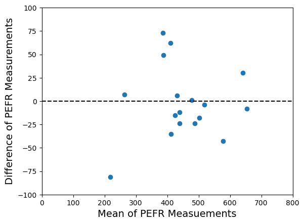
To illustrate this point I’ve constructed a synthetic example below. The left-hand plot shows the raw data in a standard scatterplot. The scatterplot suggests there is good agreement between the two samples – maybe a bit of disagreement but not much. However, when we look at the same data as a Bland-Altman plot (right-hand plot) we see a different picture. We can clearly see a systematic pattern to the discrepancy between the two samples. I’ve also estimated this systematic variation by fitting a non-linear trendline (in red) using the lowess function in the Python statsmodels package.

Sometimes we may expect a global systematic shift between our paired data samples, i.e. a constant vertical shift on the
All the code for the examples I’ve given in this post is in the Jupyter notebook DataScienceNotes1_BlandAltmanPlots.ipynb which can be found in the public GitHub repository https://github.com/dchoyle/datascience_notes. Feel free to clone the repository and play with the notebook. I’ll be adding to the repository as I add further “Data Science Notes” blogposts.
© 2025 David Hoyle. All Rights Reserved

Pingback: Data Science Notes: 2. Log-Sum-Exp – Hoyle Analytics