TL;DR: Poor mathematical-based design and testing of models can lead to significant problems in production. Finding suitable ground truth data for testing of models can be difficult. Yet, many Data Science models make it into production without appropriate testing. In these circumstances testing with simulated data can be hugely valuable. In this post I explain why and how. In fact, I argue that testing with Data Science models should be non-negotiable.
Introduction

Imagine a scenario. You’re the manager of a Premier League soccer team. You wouldn’t sign a new striker without testing if they could actually kick a ball. Wouldn’t you?
In the bad old days before VAR it was not uncommon for a big centre-back to openly punch a striker in the face if the referee and assistant referees weren’t looking. Even today, just look at any top-flight soccer match and you’ll see the blatant holding and shirt-pulling that goes on. Real-world soccer matches are dirty. A successful striker has to deal with all these realities of the game, whilst also being able to kick the ball in the net. At the very least when signing a new striker you’d want to test whether they could score under ideal benign conditions. Wouldn’t you? You’d put the ball on the penalty spot, with an open goal, and see if your new striker could score. Wouldn’t you? Passing this test, wouldn’t tell you that your striker will perform well in a real game, but if they fail this “ideal conditions” test it will tell you that they won’t perform well in real circumstances. I call this the “Harry Redknapp test” – some readers will understand the reference1. If you don’t then read the footnote for an explanation.
How is this relevant to Data Science? One of the things I routinely do when implementing an algorithm is to test that implementation on simulated data. However, a common reaction I get from other Data Scientists is, “oh I don’t test on simulated data, it’s not real data. It’s not useful. It doesn’t tell you anything.” Oh yes it does! It tells you whether the algorithm you’ve implemented is accurate under the ideal conditions it was designed for. If your implementation performs badly on simulated data, you have a big problem! Your algorithm or your implementation of it has failed the “Harry Redknapp test”.
“Yeah, but I will have some ground-truth data I can test my implementation on instead, so I don’t need simulated data.” Not always. Are you 100% sure that that ground-truth data is correct? And what if you’re working on an unsupervised problem.
“Ok, but the chances of an algorithm implemented by experienced Data Scientists making it into production untested and with really bad performance characteristics is small”. Really!? I know of at least one implemented algorithm in production at a large organization that is actually an inconsistent estimator. An inconsistent estimator is one of the biggest sins an algorithm can commit. It means that even as we give the algorithm more and more ideal training data, it doesn’t produce the correct answer. It fails the “Harry Redknapp test”. I won’t name the organization in order to protect the guilty. I’ll explain more about inconsistent estimators later on.
So maybe I convinced you that simulated data can be useful. But what can it give you, what can’t it give you, and how do you go about it?”
What simulation will give you and what it won’t
To begin, we need to highlight some general but very important points about using simulated data:
- Because we want to want to generate data, we need a model of the data generation process, i.e. we need a generative model2.
- Because we want to mimic the stochastic nature of real data, our generative model of the data will be a probabilistic one.
- Because we are generating data from a model, what we can test are algorithms and processes that use that data, e.g. a parameter estimation process. We cannot test the model itself. Our conclusions are conditional on the model form being appropriate.
With those general points emphasized, let’s look in detail what we can get testing with simulated data.
What simulated data will give you
We can get a great deal from simulated data. As we said above, what we get is insight into the performance of algorithms that process the data, such as the parameter estimation process. Specifically, we can check whether our parameter estimation algorithm is, under ideal conditions,
- Consistent
- Biased
- Efficient
- Robust
I’ll explain each of these in detail below. We can also get insight into how fast our parameter estimation process runs or how much storage it requires. Running tests using simulated data can be extremely useful.
Consistency check
As a Data Scientist you’ll be familiar with the idea that if we have only a small amount of training data our parameter estimates for our trained model will not be accurate. However, if we have a lot of training data that matches the assumptions on which our parameter estimation algorithm is based, then we expect the trained parameter estimates to be close to their true values, i.e. close to the values which generated the data. As we increase the amount of training data, we expect our parameters estimates to get more and more accurate, converging ultimately to the true values in the limit of an infinite amount of training data. This is consistency.
In statistics, a formula or algorithm for estimating the parameters of a model is called an estimator. There can be multiple different estimators for the same model, some better than others. A consistent estimator is one whose expected value converges to the true value in the limit of an infinite amount of training data. An inconsistent estimator is one whose expected value doesn’t converge to the true value in the limit of an infinite amount of training data. Think about that for a moment,
An inconsistent estimator is an algorithm that doesn’t get better even when we give it a load more training data.
That is a bad algorithm! That is why I say constructing an inconsistent estimator is one of the worst sins a Data Scientist can commit. Very occasionally (rarely), an inconsistent estimator is constructed because it has other useful properties. But in general, it you encounter an inconsistent estimator you should take it as a sign of incompetence on the part of the Data Scientist who constructed it.
“Okay, okay, I get it. Inconsistent estimators are bad. But I don’t have an infinite amount of training data, so how can I actually check if my algorithm produces a consistent estimator? Surely, it can’t be done?” Yes, it can be done. What we’re looking for is convergence, i.e. parameter estimates getting closer and closer to the true values as we increase the training set size. I’ll give a demonstration of this in the next section when I show how to set up some simulation tests.
Bias check
Along with the concept of consistency comes the concept of bias. We said that a consistent estimator was one whose expectation value converges to the true value in the limit of an infinite amount of training data. However, that doesn’t mean a consistent estimator has an expectation value that is equal to the true value for a finite amount of training data. It is possible to have a consistent estimator that is biased. This means the estimator, on average, will differ from the true value when we use a finite amount of training data. For a consistent estimator, if it is biased that bias will disappear as we continually increase the amount of training data.
As you might have guessed, the best algorithms produce estimators that are consistent and unbiased. Knowing if your estimator is biased and by how much is extremely useful. Again, we can assess bias using simulated data, and I’ll show how to do this in the next section when I show how to set up some simulation tests.
Efficiency check
So far, we have spoken about the expectation or average properties of an algorithm/estimator. But what about its variance. It is all very well telling me that across lots of different instances of training datasets my algorithm would, on average get the right answer, or near the right answer, under ideal conditions, but in the real world I have only one training dataset. Am I going to be lucky and my particular training data will give parameter estimates close to the average behaviour of the algorithm? I’ll never know. But what I can know is how variable the parameter estimates from my algorithm are. I can do this by calculating the variance of the parameter estimates over lots of training datasets. A small variance will tell me that my one real-world dataset is likely to have performance close to the mean behaviour of the algorithm. I may still be unlucky with my particular training data and the parameter estimates are a long way from the average estimates, but it is unlikely. However, a large variance tells me that parameter estimates obtained from a single training dataset will often be a long way from the average estimates.
How can I calculate this variance of parameter estimates over training datasets? Simple, get lots of different training datasets produced under identical controlled conditions. How could I do that? Yep, you guessed it. Simulation. With a simulation process coded up, we can easily generate multiple instances of training datasets of the same size and generated under identical conditions. Again, I’ll demonstrate this in the next section.
Sensitivity check – robustness to contamination
Our message about simulated data is that it allows you to test your algorithm under conditions that match the assumptions made by the algorithm, i.e. under ideal conditions. But you can use simulation to test how well your algorithm performs in non-ideal conditions. We can also introduce contamination into the simulated data, for example drawing some response variable values from a non-Gaussian distribution if our algorithm has assumed the response variable is purely Gaussian distributed. We can produce multiple simulated datsets with different percentages of contamination and so test how sensitive or robust our estimation algorithm is to the level of contamination, i.e. how sensitive it is to non-ideal data.
In the first few pages of the first chapter of his classic textbook on Robust Statistics, Peter Huber describes analysis of an experiment originally due to John Tukey. The analysis reveals that even having just 2% of “bad” datapoints being drawn from a different Gaussian distribution (with a 3-fold larger standard deviation) is enough to markedly change the properties and efficiency of common statistical estimators. And yet, defining “bad” data as being drawn from a larger variance Gaussian is wonderfully simplistic. Real-world data is so much nastier.
What form should the data contamination take? There are multiple ways in which data can become contaminated. There can be changes in statistical properties, like the simple example we used above, or drift in statistical properties such as a non-stationary mean or a non-stationary variance. But you can get more complicated errors creeping into your data. These typically take two forms,
- Human induced data contamination: These can be misspelling or mis-(en)coding errors that result from not using controlled and validated vocabularies for human data-entry tasks. You’ll recognize these sorts of errors when you see multiple different variants for the name of the same country, US county or UK city, say. You might think it is difficult to simulate such errors, but there are some excellent packages to do so – checkout the messy R package produced by Dr. Nicola Rennie that allows you to take a clean dataset and introduce these sorts of encoding errors into it. Spotting these errors can be as simple as plotting distributions of unique values in a table column, i.e. looking for unusual distributions. In R there are a number of packages to help you do this.
- Machine induced errors: These are errors that arise from the processing or transferring of data. These can be as simple as incorrect datetime stamps on rows in a database table, or can be as complex as repeating blocks of rows in a table. These errors are less about contamination and more about alteration. The common element here is that there is a pattern to how the data has become altered or modified and so spotting the errors involves visual inspection of the individual rows of the table, combined with plotting lagged or offset data values. The machine induced errors arise because of bugs in processing code, and these can be either coding errors, e.g. a typo in the code, or unintended behaviour, e.g. datetime processing code that hasn’t been designed properly to correctly handle daylight saving switchovers.

What kind of data contamination should I simulate? This is a “how long is a piece of string” kind of question. It very much depends on what aspect of your algorithm or implementation you want to test for robustness, and only you can know that. You may have to write some bespoke code to simulate the sorts of errors that arise in the processes you use or are exposed to. Broadly speaking, robustness of an estimator will be tested by changes in the statistical properties of the input data and these can be simulated by changes in the distributions of data due to data drift or human-induced contamination, whilst machine-induced errors imply you have some sort of deployed pipeline and so simulating machine corrupted data is best when you want to stress-test your end-to-end pipeline.
Runtime scaling
There are also checks that simulated data allows you to perform that aren’t necessarily directly connected to the accuracy or efficiency of the parameter estimates. Because we can produce as much simulated data as we want, we can easily test how long our estimation algorithm takes for different sized datasets. Similarly, we can also use simulated data to test the memory and storage requirements of the algorithm.
We can continue this theme. Because we can tune and tweak the generation of the simulated data, this can also allow us to generate data to test very specific scenarios – corner cases – for which we don’t have real test data. The ability to generate simulated data increases the test coverage we can perform.
What simulated data won’t give you
Identify model mis-specification
Using simulated data will tell you how well your model training algorithm performs on data that matches precisely the form of the model you have used. It won’t tell you if your model form is correct or appropriate for the real data you will ultimately apply it to. It won’t tell you if you’ve omitted an important feature or if you’ve put non-linearity into your model in an incorrect way. Getting the model form right can only come from i) domain expertise, ii) testing on real ground-truth data. Again, what this highlights is that we use simulated data to test the training process, not the model.
This can trip up even experience researchers. I recently saw a talk from an academic researcher who tested two different model forms using simulated data generated from one of the models. When the model form used to generate the data fitted the simulation data better, they confidently claimed that this model was better and more correct. Well, of course it was for this simulated data!
Accuracy of your model on real data
For simulated data we have the ground-truth values of the response variable so we can assess the prediction accuarcy, either on training data or on holdout test data. However, unless our simulation process produced very realistic data, including the various contamination processes, the test set accuracy on simulated data cannot be used as a precise measure of the predictive accuracy of the trained model on real unseen data.
How to simulate
When producing simulated data for testing an algorithm related to a model there are two things we need to generate – the features and the response. There are two ways we can approach this,
- Simulating the features and then simulating the response given the feature values we just produced.
- Simulate just the response value given some pre-existing feature values.
Of these, 2 sounds easier, but I will discuss 1 first as it leads us naturally into discussing where we might get pre-existing feature values from.
Simulating features and response
As we said above, in this approach we simulate the features first, and this allows us to construct the distribution of the response variable conditional on the features. We can then sample a value from that conditional distribution. Our basic recipe is
- Sample the feature values from a distribution.
- Use the sampled feature values and the model form to construct the distribution of the response variable conditional on the features.
- Sample the response variable from the conditional distribution constructed in 2.

How complex we want to make the feature distribution depends on how realistic we need our features to be and what aspect of the estimation/training algorithm we are wanting to test.
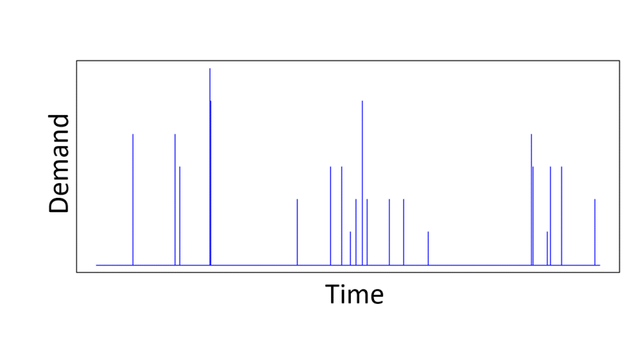
For real-world problems, it is unlikely that the features follow a Gaussian distribution. Take demand modelling, an area I have worked in a lot. The main feature we use is the price of the product whose demand we are trying to predict. Prices are definitely not Gaussian distributed. Retailers repeatedly switch between a regular and promotional price over a long period of time, so that we have a sample distribution of prices that is represented by two Dirac-delta functions. A more interesting price time series may introduce a few more price points, but it is still definitely not Gaussian. Similarly, real data has correlations between features.
When simulating a feature, we have to decide how important the real distribution is to the aspect of the estimation/training algorithm that we want to test. If we want to simulate with realistically distributed features. this can be problematic. We’ll return to this issue and real data later on, but for now we emphasize tha we can still test whether our estimator is consistent or assess its bias using features drawn from independent Gaussian distributions. So there are still useful tests of our estimation algorithm we can carry out. Let’s see how we can do that.
Linear model example
We’ll use a simple linear model that depends on three features,  . The response variable
  is given by,

From which you can see both the linear dependence on the features and that contains Gaussian additive noise  .
.
Simulating data is now easy once we have the structure of our probabilistic model. Given a user-specified mean  and variance
  we can easily sample a value for
  from
from  . Similarly, given user-specified means
  and variances
  , we can generate values for
  and
and  . If we have user-specified values of
  we can then easily generate a value for by sampling from
  , where
  is the variance of the additive noise that we want to add to our response variable. To simulate
  datapoints we repeat that recipe times. Let’s apply that recipe to assess an estimator of the model parameters . We’ll assess the standard Ordinary Least Squares (OLS) estimator for a linear model.
Assessing the OLS Estimator for a linear model
Given a feature matrix  (the ith row of the matrix is the feature values for the ith observation) and vector
  that represents the observations of the response variable, then the Ordinary Least Squares (OLS) estimator
  of the true model parameters
  is given by the formula,

Note that the OLS estimator is a linear combination of the observations  , with a weight matrix
  . We’ll come back to this point in a moment.
What we want to know is how close is the estimate  to
to  . Is the OLS estimator in the Eq.1 above a biased estimator of , and is it a consistent estimator?
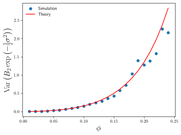
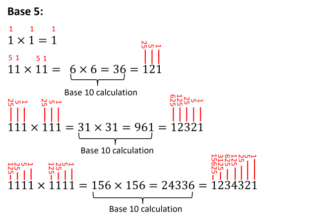
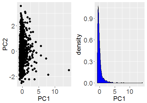
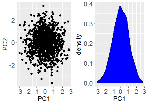
The plots below show the bias (mean error) for each of the model parameters, plotted against training dataset size . I constructed the plots by initializing a true model parameter vector and then generating 1000 simulated training datasets for each of the different values of . For each simulated training dataset I computed the OLS parameter estimate  and then computed the parameter estimate errors
  . From the errors I then calculated their sample means and variances (over the simulations) for each value of .
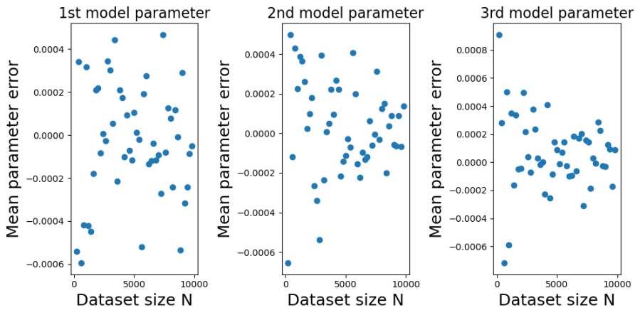
You can see from the plots that whilst the mean error fluctuates it doesn’t systematically change with . Furthermore, it fluctuates around zero, suggesting that the OLS estimator is unbiased. And indeed it is. It is possible to mathematically show that the OLS estimator is unbiased at any finite value of . The reason we get a non-zero value in this case is because we have estimated  using a sample average taken over 1000 simulated datasets. If we had used a larger number of simulated datasets we would have got even smaller sample average parameter errors.
Contrast this behaviour with how the variances of the parameter estimate errors change with in the plots below.
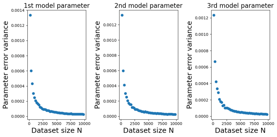
The decrease, with , in the variance of is marked. In fact, in looks like a power-law decrease, so I have plotted the same data on a log-scale below,

We can see from those log-log plots that the variances of  decrease as
  . That implies that as we use larger and larger training sets any single instance of will get closer and closer to . At large we have a low probability of being unlucky and our particular training set giving a poor estimate of .
How efficient is the OLS estimator in Eq.1? Is the rate at which  decreases with good or bad? It turns out that the OLS estimator in Eq.1 is the Best Linear Unbiased Estimator (BLUE). For an unbiased estimator of that is constructed as a linear combination of the observations
  , you cannot do better than the OLS estimator in Eq. 1.
All the code for the linear model example is available in the Jupyter notebook NeedForSimulation_Blogpost.ipynb in the GitHub repository https://github.com/dchoyle/simulation_blogpost.
A linear model is relatively simple structure but the example was a good demonstration of the power of simulated data. Next, we’ll use a more complex model architecture and build a feed-forward neural network.
Neural network example
Our simulated neural network output has the form,

Again, we’ll use zero-mean Gaussian additive noise,  .
.
The function  represents our neural network function, with
  being the vector of input features and
  being a vector holding all the network parameters. For this demo, I’m going to use a 3 input-node, 2 hidden-layer feed-forward network, with 10 nodes in each of the hidden layers. The output layer consists of a single node, representing the variable . For the non-linear transfer (activation) functions I’m going to use
  functions. So, schematically, my networks looks like the figure below,

I’m going to use a teacher network of the form above to generate simulated data, which I’ll then use to train a student network of the same form. What I want to test is, does my training process produce a trained student network whose predictions on a test set get more and more accurate as I increase the amount of training data? If not, I have a problem. If my training process doesn’t produce accurate trained networks on ideal data, the training process isn’t going to produce accurate networks when using real data. I’m less interested in comparing trained student network parameters to the teacher network parameters as, a) there are a lot of them to compare, b) since the output of a network is invariant to within-layer permutation of the hidden layer node labels and connections, defining a one-to-one comparison of network parameters is not straight forward here. Node 1 in the first hidden layer of the student isn’t necessarily equivalent to node 1 in the first hidden layer of the teacher network, and so on.
The details of how I’ve coded up the networks and set-up the evaluation are lengthy, so I’ll just show the final result here. All the details can be found in the Jupyter notebook NeedForSimulation_Blogpost.ipynb in the freely accesible github repository.
Below in left-hand plot I’ve plotted the average Mean Square Error (MSE) made by the trained student network on the test-sets. I’ve plotted the average MSE against the training dataset size. The average MSE is the average over the simulations of that training set size. For comparison, I have also calculated the average test-set MSE of the teacher network. Since the test-set data contains additive Gaussian noise, the teacher network won’t make perfect predictions on the test-set data even though the teacher network generated the systematic part of the test-set response values. The average test-set MSE of the teacher network provides a benchmark or baseline against which we can asses the trained student network. We have a ready intuition about the relative test-set MSE value. We expect the relative test-set MSE to be significantly above 1 at small values of , as the student network struggles to learn the teacher network output. As the amount of training data increases we expect the relative test-set MSE value to approach 1 from above. The average relative test-set error is plotted in the right-hand plot below.

We can see from both plots above that the prediction accuracy of a trained student network typically decreases with increasing amount of training data. My network training process has passed this basic test. The test was quick to set up and gives me confidence I can run my code over real data.
Sampling features from more realistic distributions
In our previous examples we have used independent features, sampled from simple but naive distributions, to test the convergence properties of an estimator. But what happens if you want to assess the quantitative performance of an estimator for more realistic feature patterns? Well, we use more realistic feature patterns. This is a variant of our previous basic recipe, but where we have access to a real dataset. The modified recipe is,
- Sample an observation from the real dataset and keep the features.
- Use the sampled feature values and the model form to construct the distribution of the response variable conditional on the features.
- Sample the response variable from the conditional distribution constructed in 2.
This seems like a small modification of the recipe. However, it does have some big implications. We can’t generate simulated datasets of arbitrarily large size as we are limited by the size of the real dataset. We can obviously generate simulated datasets of smaller size than the real data, but this can make testing of the convergence properties of an estimator difficult.
That said, this is one of my faviourite approaches. Often, steps 2 and 3 are easy to implement. You’ll have a function for the conditional mean of the response variable already coded up for prediction purpose, so it is just a question of pushing some feature values through that code. I find the overhead of writing extra functions to simulate realistic looking feature values is significant, both in terms of time and thinking about what ‘realistic’ should look like. The recipe above gets round this easily. Simply pick a row from your existing real dataset at random and there you go, you have some realistic feature values. As before, the recipe allows me to then generate response values with known ground-truth parameters values. So overall I can compare parameter estimates to ground truth parameter values on realistic feature values, allowing me to check that my estimation algorithm is at least semi-accurate on realistic feature values. You can also choose in step 1 of the recipe, whether you want to sample a row of feature values with or without replacement.
Simulating the response only
You could argue that simulating response values with feature values sampled from an existing real dataset is an example of just simulating the response. After all, only the response value is computer generated. I still tend to think of it as simulating the features because, i) I am still sampling the features from a distribution function, the empirical distribution function in this case, and ii) I have broken some of the link between the features and the response in the real data because I have sampled the features values separately. However, sometimes we want to keep as much as of the links between features and response values in the real data as possible. We can do this by only making additions to the real data. By necessity this means only adding to the response value. This may sound very restrictive, but in fact there are many situations where this is precisely the kind of data we need to test an estimation algorithm. For example, changepoint detection or unconditional A/B testing. In these situations we take the real data, identify the split point where we want to increase the response value (the changepoint or the A/B grouping) and simply increase the response. Hey presto, we have realistic data with a guaranteed increase in the response variable at a know location. By changing the level of increase in the response variable we can use this approach to assess the statistical power of the changepoint or A/B test algorithm.
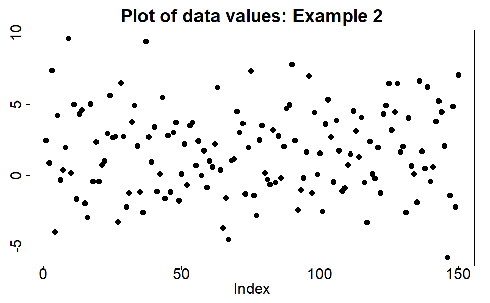
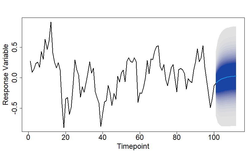
The plots below show an example of introducing a simple shift in level at timepoint 53 into a real dataset. We have only shown the process as a simple schematic, but coding it up yourself is only a matter of a line or two of code, so I haven’t given any code details.

In the above example I simply increased the response variable, by the same amount (8.285 in this case), at and after timepoint 53. If instead, you only want to increase the average value of the response variable, it is a simple modification of the process to include some additional zero-mean noise after the changepoint location.
Conclusions
Simulated data is extremely useful. It can give you lots of insight into the performance of your training/estimation algorithm (including bug detection). Its main advantages are it is,
- Easy to produce in large volumes.
- Can be produced in a user-controlled way.
- Gives you ground-truth values.
- Gives you a way to assess the performance of your training algorithm when you have no real ground-truth data.
- Stops you releasing a poor untested training algorithm into production.
If you don’t want to sign an absolutely useless striker for your data science model team, test with simulated data at the very minimum.
Footnotes
- Harry Redknapp is a former English Premier League football manager. Whilst Redknapp was manager of Tottenham Hotspur he had a reputation of being willing to sign players on the flimiest of evidence of footballing skills. At a time when there was a large influx of overseas players into the Premier league, due to their reputation for superior technical football skills, it was joked that he would sign a player simply because of how their name sounded and without any checks on the player at all.
- The term generative model preceeds its useage in Generative AI. Broadly speaking, a generative model is a machine learning model that learns the underlying probability distribution of the data and can generate new, similar data instances. The useage of the term was popular around the early 2000’s, particularly when discussing different forms of classifiers, which were described as either being generative or discriminative.
© 2025 David Hoyle. All Rights Reserved


 of our data are outliers, then we can use a trimmed-variance to estimate the population variance without having to explicitly identify the outliers.
 Eq.1
Eq.1 is the mean of the probability distribution and
  is its standard deviation. The part of the probability distribution that corresponds to the central 90% of the probability distribution is given by the interval
 ![\left [ -\sigma x_{5} + \mu , \sigma x_{5} + \mu \right ]](https://s0.wp.com/latex.php?latex=%5Cleft+%5B+-%5Csigma+x_%7B5%7D+%2B+%5Cmu+%2C+%5Csigma+x_%7B5%7D+%2B+%5Cmu+%5Cright+%5D&bg=ffffff&fg=111111&s=0&c=20201002) , where
, where  corresponds to the 5th centile of the standard Normal distribution and so is given by,
 Eq.2
Eq.2 about the mean
 ![\frac{1}{\sqrt{2\pi\sigma^{2}}}\int_{-x_{5} }^{x_{5}} x^{2}\,\exp \left ( -\frac{x^{2}}{2\sigma^{2}}\right )\, dx\;=\; 0.9\sigma^{2}\left [ 1 + \frac{2}{0.9}\Phi^{-1}\left ( 0.05\right ) \phi \left ( \Phi^{-1}\left ( 0.05 \right )\right ) \right ]](https://s0.wp.com/latex.php?latex=%5Cfrac%7B1%7D%7B%5Csqrt%7B2%5Cpi%5Csigma%5E%7B2%7D%7D%7D%5Cint_%7B-x_%7B5%7D+%7D%5E%7Bx_%7B5%7D%7D+x%5E%7B2%7D%5C%2C%5Cexp+%5Cleft+%28+-%5Cfrac%7Bx%5E%7B2%7D%7D%7B2%5Csigma%5E%7B2%7D%7D%5Cright+%29%5C%2C+dx%5C%3B%3D%5C%3B+0.9%5Csigma%5E%7B2%7D%5Cleft+%5B+1+%2B+%5Cfrac%7B2%7D%7B0.9%7D%5CPhi%5E%7B-1%7D%5Cleft+%28+0.05%5Cright+%29+%5Cphi+%5Cleft+%28+%5CPhi%5E%7B-1%7D%5Cleft+%28+0.05+%5Cright+%29%5Cright+%29%C2%A0%C2%A0%C2%A0%C2%A0+%5Cright+%5D&bg=ffffff&fg=111111&s=0&c=20201002) Eq. 3
Eq. 3 is the CDF of the Standard Normal distribution and so
  . The right-hand side of Eq.3 is 0.9 times what we would get if we had an infinite sample of data from a Normal distribution with standard deviation of
  .
.![s^{2} \simeq \sigma^{2}\left [ 1 + \frac{2}{0.9}\Phi^{-1}\left ( 0.05\right ) \phi \left ( \Phi^{-1}\left ( 0.05 \right )\right ) \right ]](https://s0.wp.com/latex.php?latex=s%5E%7B2%7D+%5Csimeq+%5Csigma%5E%7B2%7D%5Cleft+%5B+1+%2B+%5Cfrac%7B2%7D%7B0.9%7D%5CPhi%5E%7B-1%7D%5Cleft+%28+0.05%5Cright+%29+%5Cphi+%5Cleft+%28+%5CPhi%5E%7B-1%7D%5Cleft+%28+0.05+%5Cright+%29%5Cright+%29%C2%A0%C2%A0%C2%A0%C2%A0+%5Cright+%5D+&bg=ffffff&fg=111111&s=0&c=20201002) Eq.4
Eq.4 from our trimmed data sample. We just use,
![\hat{\sigma}^{2}\simeq \frac{s^{2}}{\left [ 1 + \frac{2}{0.9}\Phi^{-1}\left ( 0.05\right ) \phi \left ( \Phi^{-1}\left ( 0.05 \right )\right ) \right ] }](https://s0.wp.com/latex.php?latex=%5Chat%7B%5Csigma%7D%5E%7B2%7D%5Csimeq+%5Cfrac%7Bs%5E%7B2%7D%7D%7B%5Cleft+%5B+1+%2B+%5Cfrac%7B2%7D%7B0.9%7D%5CPhi%5E%7B-1%7D%5Cleft+%28+0.05%5Cright+%29+%5Cphi+%5Cleft+%28+%5CPhi%5E%7B-1%7D%5Cleft+%28+0.05+%5Cright+%29%5Cright+%29%C2%A0%C2%A0%C2%A0%C2%A0+%5Cright+%5D+%7D&bg=ffffff&fg=111111&s=0&c=20201002) Eq.5
Eq.5 of values, we can easily generalize the formula in Eq.5. I’ll leave it to you as an exercise to do the derivation. I’m just going to quote the final result below,
![\hat{\sigma}^{2}\;=\; \frac{s^{2}}{\left [ 1 + \frac{2}{1 - \alpha}\Phi^{-1}\left ( \frac{1}{2}\alpha\right ) \phi \left ( \Phi^{-1}\left ( \frac{1}{2}\alpha \right )\right ) \right ] }](https://s0.wp.com/latex.php?latex=%5Chat%7B%5Csigma%7D%5E%7B2%7D%5C%3B%3D%5C%3B+%5Cfrac%7Bs%5E%7B2%7D%7D%7B%5Cleft+%5B+1+%2B+%5Cfrac%7B2%7D%7B1+-+%5Calpha%7D%5CPhi%5E%7B-1%7D%5Cleft+%28+%5Cfrac%7B1%7D%7B2%7D%5Calpha%5Cright+%29+%5Cphi+%5Cleft+%28+%5CPhi%5E%7B-1%7D%5Cleft+%28+%5Cfrac%7B1%7D%7B2%7D%5Calpha+%5Cright+%29%5Cright+%29+%C2%A0%C2%A0%5Cright+%5D+%7D&bg=ffffff&fg=111111&s=0&c=20201002) Eq.6
Eq.6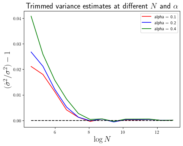
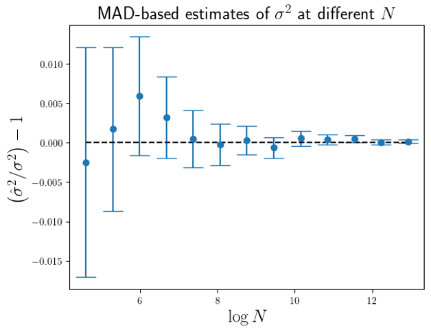
 . At
. At  we are actually estimating the variance from 900 data points. The effective sample size is 900. Whilst for
  the variance is estimated from a trimmed sample consisting of 600 data points. In order to compare like effective sample sizes with like effectve sample sizes I simply need to adjust the x-axis values in Fig.1 by
  . This I have done in Figure 2 below.
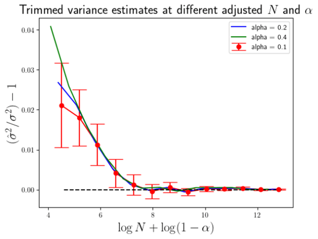
 times the standard errors of the means in the
  Eq.7
Eq.7 Eq. 8
Eq. 8 . Again, I have actually plottted the ratio of the simulation average of
  to
to  2 standard errors of the simulation means, with the standard error simply estimated from the variance over the simulation results.
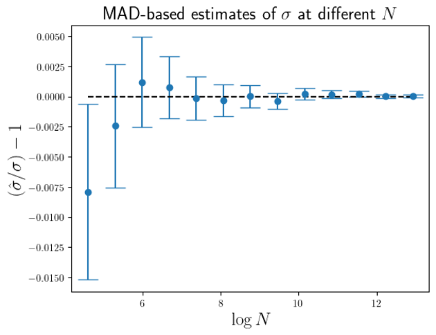
 are larger than the standard errors of the mean of
  (for this MAD-based estimator).
 Eq.1
Eq.1 and
and  are constants. With just your high-school mathematics, you can see that Eq. 1 is just a linear equation. With just high-school maths you can confidently understand that as
  increases then so does
  .
. is called the metric tensor, and
  ) affects how curved spacetime is. The more mass we have or the higher the energy density, then the more spacetime will be curved. And the curvature of spacetime affects the dynamics of anything moving in that spacetime. This simple high-level picture is so easy to grasp that the famous cosmologist
  Eq.2
Eq.2 . Eq.3
 . The function
  ”. You can see where the name Generalized Linear Model comes from. It is just a non-linear transformation of the same thing we focus on when build a linear model.
 can be off-putting when you first encounter them. Consequently, many Data Scientists don’t persevere with GLMs. When you understand what Eq.3 is saying at high-level they are very easy to understand. When we step away from the messy detail of “how” to code the non-linearity and instead focus on the “what” of what we want to achieve – introduce a non-linear relationship between the mean of our target variable and a linear combination of predictive features – then Eq.3 becomes the intuitive and obvious way to do it. Coding it up then becomes easy.


 with
with  , we have the well-known result,
 to a random variable
  .
. to
to  via a simple bias-correction factor
  . So, if we had a sample of
  . We can estimate
  , which I’ll denote by
  then
then 
 is given by,
 , of the bias correction factor needed, with
 from an estimate of
 and
and  converge to
  as
as  , and if so how fast?
 are Gaussian random variables we can express these expectation values in terms of simple integrals and we get,
![\mathbb{E}\left ( B_{1}\right )\;=\; \left( 2\pi\sigma^{2}\right)^{-\frac{N}{2}}\int_{{\mathbb{R}}^{N}} d{\underline{x}}\exp\left [-\frac{1}{2\sigma^{2}}\left ( \underline{x} - \mu\underline{1}_{N}\right )^{\top}\left ( \underline{x} - \mu\underline{1}_{N}\right )\right ] \exp\left[ \frac{1}{2} \underline{x}^{\top}\underline{\underline{M}}\underline{x}\right ]](https://s0.wp.com/latex.php?latex=%5Cmathbb%7BE%7D%5Cleft+%28+B_%7B1%7D%5Cright+%29%5C%3B%3D%5C%3B+%5Cleft%28+2%5Cpi%5Csigma%5E%7B2%7D%5Cright%29%5E%7B-%5Cfrac%7BN%7D%7B2%7D%7D%5Cint_%7B%7B%5Cmathbb%7BR%7D%7D%5E%7BN%7D%7D+d%7B%5Cunderline%7Bx%7D%7D%5Cexp%5Cleft+%5B-%5Cfrac%7B1%7D%7B2%5Csigma%5E%7B2%7D%7D%5Cleft+%28+%5Cunderline%7Bx%7D+-+%5Cmu%5Cunderline%7B1%7D_%7BN%7D%5Cright+%29%5E%7B%5Ctop%7D%5Cleft+%28+%5Cunderline%7Bx%7D+-+%5Cmu%5Cunderline%7B1%7D_%7BN%7D%5Cright+%29%5Cright+%5D+%5Cexp%5Cleft%5B+%5Cfrac%7B1%7D%7B2%7D+%5Cunderline%7Bx%7D%5E%7B%5Ctop%7D%5Cunderline%7B%5Cunderline%7BM%7D%7D%5Cunderline%7Bx%7D%5Cright+%5D&bg=ffffff&fg=111111&s=0&c=20201002) Eq.1
Eq.1 is given by,
 .
. is an N-dimensional vector consisting of all ones, and
  is the
  identity matrix.
![\mathbb{E}\left ( B_{2}\right )\;=\;\frac{1}{N}\sum_{i=1}^{N} \left( 2\pi\sigma^{2}\right)^{-\frac{N}{2}}\int_{{\mathbb{R}}^{N}} d{\underline{x}}\exp\left [-\frac{1}{2\sigma^{2}}\left ( \underline{x} - \mu\underline{1}_{N}\right )^{\top}\left ( \underline{x} - \mu\underline{1}_{N}\right )\right ] \exp \left [ \sum_{j=1}^{N}\left ( \delta_{ij} - \frac{1}{N}\right )x_{j}\right ]](https://s0.wp.com/latex.php?latex=%5Cmathbb%7BE%7D%5Cleft+%28+B_%7B2%7D%5Cright+%29%5C%3B%3D%5C%3B%5Cfrac%7B1%7D%7BN%7D%5Csum_%7Bi%3D1%7D%5E%7BN%7D+%5Cleft%28+2%5Cpi%5Csigma%5E%7B2%7D%5Cright%29%5E%7B-%5Cfrac%7BN%7D%7B2%7D%7D%5Cint_%7B%7B%5Cmathbb%7BR%7D%7D%5E%7BN%7D%7D+d%7B%5Cunderline%7Bx%7D%7D%5Cexp%5Cleft+%5B-%5Cfrac%7B1%7D%7B2%5Csigma%5E%7B2%7D%7D%5Cleft+%28+%5Cunderline%7Bx%7D+-+%5Cmu%5Cunderline%7B1%7D_%7BN%7D%5Cright+%29%5E%7B%5Ctop%7D%5Cleft+%28+%5Cunderline%7Bx%7D+-+%5Cmu%5Cunderline%7B1%7D_%7BN%7D%5Cright+%29%5Cright+%5D%C2%A0+%5Cexp+%5Cleft+%5B+%5Csum_%7Bj%3D1%7D%5E%7BN%7D%5Cleft+%28+%5Cdelta_%7Bij%7D+-+%5Cfrac%7B1%7D%7BN%7D%5Cright+%29x_%7Bj%7D%5Cright+%5D&bg=ffffff&fg=111111&s=0&c=20201002) Eq.2
Eq.2 Eq.3
Eq.3![\mathbb{E}\left ( B_{2}\right )\;=\; \exp \left [ \frac{\sigma^{2}}{2}\left ( 1\;-\;\frac{1}{N}\right )\right ]](https://s0.wp.com/latex.php?latex=%5Cmathbb%7BE%7D%5Cleft+%28+B_%7B2%7D%5Cright+%29%5C%3B%3D%5C%3B+%5Cexp+%5Cleft+%5B+%5Cfrac%7B%5Csigma%5E%7B2%7D%7D%7B2%7D%5Cleft+%28+1%5C%3B-%5C%3B%5Cfrac%7B1%7D%7BN%7D%5Cright+%29%5Cright+%5D&bg=ffffff&fg=111111&s=0&c=20201002) Eq.4
Eq.4 . However, what is noticeable is at finite
  has a divergence. Namely, as
  , we have
  and for
  , we have that
  doesn’t exist. This means that for a finite sample size there are situations where the parametric form of the bias correction will be very very wrong.
 and
and  and
and  . These calculations are similar to the evaluation of
  and
and  Eq.5
Eq.5![{\rm Var}\left ( B_{2}\right)\;=\; \left ( 1 - \frac{1}{N}\right )\exp \left [ \sigma^{2}\left ( 1 - \frac{2}{N}\right )\right ]\;+\;\frac{1}{N}\exp \left [ 2\sigma^{2}\left ( 1 - \frac{1}{N}\right )\right ]\;-\; \exp \left [ \sigma^{2}\left ( 1 - \frac{1}{N}\right )\right ]](https://s0.wp.com/latex.php?latex=%7B%5Crm+Var%7D%5Cleft+%28+B_%7B2%7D%5Cright%29%5C%3B%3D%5C%3B+%5Cleft+%28+1+-+%5Cfrac%7B1%7D%7BN%7D%5Cright+%29%5Cexp+%5Cleft+%5B+%5Csigma%5E%7B2%7D%5Cleft+%28+1+-+%5Cfrac%7B2%7D%7BN%7D%5Cright+%29%5Cright+%5D%5C%3B%2B%5C%3B%5Cfrac%7B1%7D%7BN%7D%5Cexp+%5Cleft+%5B+2%5Csigma%5E%7B2%7D%5Cleft+%28+1+-+%5Cfrac%7B1%7D%7BN%7D%5Cright+%29%5Cright+%5D%5C%3B-%5C%3B+%5Cexp+%5Cleft+%5B+%5Csigma%5E%7B2%7D%5Cleft+%28+1+-+%5Cfrac%7B1%7D%7BN%7D%5Cright+%29%5Cright+%5D&bg=ffffff&fg=111111&s=0&c=20201002) Eq.6
Eq.6 , so much before
  . The divergence in
  , so
, so  gives us a way of measuring how problematic the value of
  occurs at
  . I chose to set
  in my simulations, so quite a small sample but there are good reasons that I’ll explain later. For each value of
  sample datasets, each of
  , as a function of
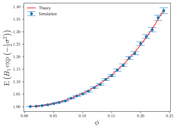
 . For
. For  . Whilst this is large for the additive log-scale noise, it is not ridiculously large. It shows that the presence of the divergence at
  (derived from Eq.5), rather than the simulation sample estimate of it. The reason being that once one goes above about
  .
. , where the simulation sample size is sufficiently large enough that we can trust our simulation sample based estimates of
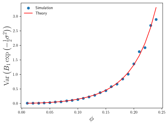
 compare to the theoretical results in Eq.4 and Eq.6 ? I’ve plotted these in Figures 3 and 4 below.
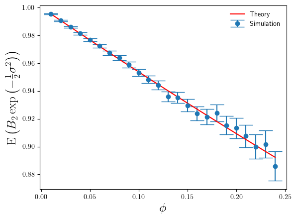
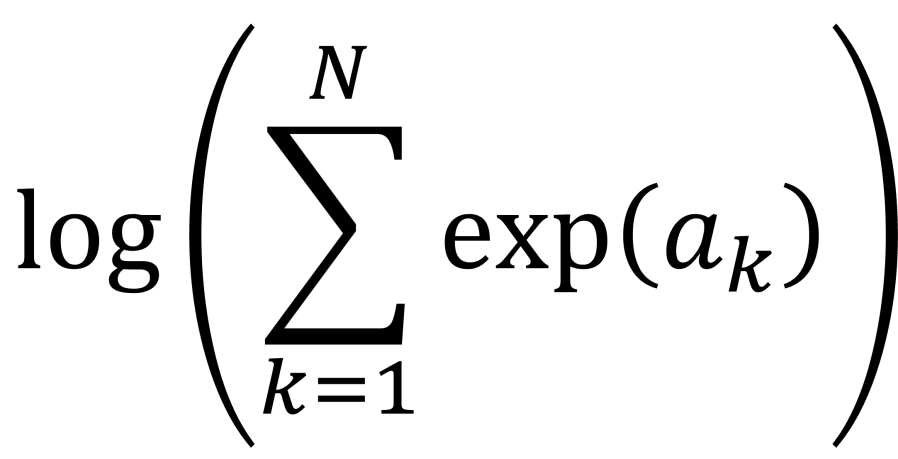
 . This calculation is called log-sum-exp.
 function.
 , where you have values for the
  . Really? Will you? Yes, it will probably be calculating a log-likelihood, or a contribution to a log-likelihood, so the actual calculation you want to do is of the form,
 and
and  and
and  to
to  we are using floating point arithmetic to try and add a very large number to a much smaller number. Most likely we will get an overflow error. If would be much better if we’d started with
  , which would be very negative and from this we could easily infer that adding
  by
by  and computes an accurate approximation to
  without encountering underflow or overflow errors.
![a = [a_{1}, a_{2}, \ldots, a_{N}]](https://s0.wp.com/latex.php?latex=a+%3D+%5Ba_%7B1%7D%2C+a_%7B2%7D%2C+%5Cldots%2C+a_%7BN%7D%5D&bg=ffffff&fg=111111&s=0&c=20201002) . Let’s say, without loss of generality, the maximum value is
. Let’s say, without loss of generality, the maximum value is 
 are all negative for
  , so we can easily approximate the logarithm on the right-hand side of the equation by a suitable expansion of
  . This is the “log-sum-exp” trick.

 , it is also relatively easy to show that,

 are allowed to be negative. This means, that when we are using the SciPy log-sum-exp function to perform the log-sum-exp trick, we can actually use it to calculate numerically stable estimates of sums of the form,
 .
. . This is because the first two contributions,
  .
.


 are omitted and we simply define our new features as,

 against
  . I’ve shown the new plot below.


![\rm{[currency]}^{-1}](https://s0.wp.com/latex.php?latex=%5Crm%7B%5Bcurrency%5D%7D%5E%7B-1%7D&bg=ffffff&fg=111111&s=0&c=20201002) , then so must the left-hand side. Similarly, arguments to transcendental functions such as exp or sin and cos must be dimensionless. These checks are a quick and easy way to spot if a formula is inadvertently missing a dimensionful factor.
, then so must the left-hand side. Similarly, arguments to transcendental functions such as exp or sin and cos must be dimensionless. These checks are a quick and easy way to spot if a formula is inadvertently missing a dimensionful factor.
 . Obviously we want to retain as much of the structure and variation of the original data, so we choose our k-dimensional subspace such that the variance of the original data in the subspace is as high as possible. Given a mean-centered data matrix
  as 1,
as 1,
 , and their corresponding eigenvalues
  .
. -dimensional PCA subspace is then spanned by the
  , Welling et al notation =

 is
is  and its columns are the principal components that span the low dimensional subspace we are trying to model.
 is
is  and its rows are the minor components that define the
  subspace where we want as little variation as possible.
 that span a low-dimensional subspace and again form the columns of a matrix
  , have unusually large variance, some of them, say
  , have unusually small variance. The overall number of extreme components (XC) is
  .
. . They do this by introducing a projection operator
  . Again we model the data as coming from a zero-mean multivariate Gaussian, but for XCA the final covariance matrix is then of the form,

 , where the rows of the
  matrix

 for
for  in the PPCA formulation, and the replacement of
  for
for  , whilst previously when we defined the minor components subspace as the subspace where we wanted to constrain the data away from, we needed
  directions. The probabilistic formulation of XCA is a very natural and efficient way to express MCA.
 , but we need to work out which ones. We can use the likelihood value at the maximum likelihood solution to do that for us.
 extreme components overall, and we’ll use
  to denote the corresponding set of eigenvalues of
 ![\log L_{ML} = - \frac{Nd}{2}\log \left ( 2\pi e\right )\;-\;\frac{N}{2}\sum_{i\in {\cal{C}}}\lambda_{i}\;-\;\frac{N(d-k)}{2}\log \left ( \frac{1}{d-k}\left [ {\rm tr}\hat{\underline{\underline{C}}} - \sum_{i\in {\cal{C}}} \lambda_{i}\right ]\right )](https://s0.wp.com/latex.php?latex=%5Clog+L_%7BML%7D+%3D+-+%5Cfrac%7BNd%7D%7B2%7D%5Clog+%5Cleft+%28+2%5Cpi+e%5Cright+%29%5C%3B-%5C%3B%5Cfrac%7BN%7D%7B2%7D%5Csum_%7Bi%5Cin+%7B%5Ccal%7BC%7D%7D%7D%5Clambda_%7Bi%7D%5C%3B-%5C%3B%5Cfrac%7BN%28d-k%29%7D%7B2%7D%5Clog+%5Cleft+%28+%5Cfrac%7B1%7D%7Bd-k%7D%5Cleft+%5B+%7B%5Crm+tr%7D%5Chat%7B%5Cunderline%7B%5Cunderline%7BC%7D%7D%7D+-+%5Csum_%7Bi%5Cin+%7B%5Ccal%7BC%7D%7D%7D+%5Clambda_%7Bi%7D%5Cright+%5D%5Cright+%29&bg=ffffff&fg=111111&s=0&c=20201002)
 of
of  , but that could be a 3 PCs + 3 MCs split, or a 2 PCs + 4MCs split, and so on. To determine which we simply compute the maxium likelihood value for all the possible values of
  to
to  , each time keeping the largest
  values of
  don’t change as we vary
  defined by,
 for all values of
  whose eigenvalues
  have been set to the following values,
 to
to  . The last
  , so that when I plot the minor component eigenvalues of
  datapoints, each with
  features. For this dataset I chose
  . From the simulated data I computed the sample covariance matrix
 extreme components. The minimum value of
  , indicating that the method of Welling et al estimates that there are 10 principal components in this dataset, and by definition there are then
  minor components in the dataset. In this case, the XCA algorithm has identified the dimensionalities of the PC and MC subspaces exactly.
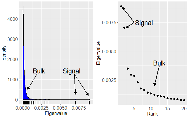
 , and that the extreme component population covariance eigenvalues were distinctly different from the ‘noise’ population eigenvalues. This ensured that the sample covariance eigenvalues separated into three clearly visible groups.
 and/or weak signal strengths for the extreme components of the population covariance, then the extreme component sample covariance eigenvalues may not be separated from the bulk of the other eigenvalues. As we increase the ratio
  we observe a series of phase transitions at which each of the extreme components becomes detectable – again this is another of my areas of research expertise [
 Bessel correction in the definition of the sample covariance. This is because I have assumed any data matrix will have been explicitly mean-centered. In many of the analyses of PCA the starting assumption is that the data is drawn from a mean-zero distribution, so that the sample mean of any feature is zero only under expectation, not as a constraint. Consequently, most formal analysis of PCA will define the sample covariance matrix with a
  factor. Since I have to deal with real data, I will never presume the data been drawn from population distribution that has zero-mean and so to model the data with a zero-mean distribution I will explicitly mean-center the data. Therefore, I use the
  definition of the sample covariance. Strictly speaking, that means the various theories and analyses I discuss later in the post are not applicable to the data I’ll work with. It is possible to modify the various analyses to explicitly take into account the mean-centering step, but it is tedious to do so. In practice, (for large

 Eq.1
Eq.1
![[\frac{1}{x_{max}}, x_{max}]](https://s0.wp.com/latex.php?latex=%5B%5Cfrac%7B1%7D%7Bx_%7Bmax%7D%7D%2C+x_%7Bmax%7D%5D&bg=ffffff&fg=111111&s=0&c=20201002) so that the probability distribution of
so that the probability distribution of  at the end. For convenience, well take
  to be of the form
  , and so the limit
  .
.

 with
with  and
and  . So, the total probability of getting such a number is,
![{\rm{Prob}} \left ( {\rm{first\;digit}}\;=\;d \right ) = \frac{2k_{max}}{2\ln x_{max}} \left [ \ln ( d+1 ) - \ln d\right ]\;\;.](https://s0.wp.com/latex.php?latex=%7B%5Crm%7BProb%7D%7D+%5Cleft+%28+%7B%5Crm%7Bfirst%5C%3Bdigit%7D%7D%5C%3B%3D%5C%3Bd+%5Cright+%29+%3D+%5Cfrac%7B2k_%7Bmax%7D%7D%7B2%5Cln+x_%7Bmax%7D%7D+%5Cleft+%5B+%5Cln+%28+d%2B1+%29+-+%5Cln+d%5Cright+%5D%5C%3B%5C%3B.&bg=ffffff&fg=111111&s=0&c=20201002)
 , we get,
![{\rm{Prob}} \left ( {\rm{first\;digit}}\;=\;d \right ) = \frac{1}{\ln 10} \left [ \ln ( d+1 ) - \ln d\right ]\;=\;\log_{10} \left ( 1 + \frac{1}{d}\right )\;\;.](https://s0.wp.com/latex.php?latex=%7B%5Crm%7BProb%7D%7D+%5Cleft+%28+%7B%5Crm%7Bfirst%5C%3Bdigit%7D%7D%5C%3B%3D%5C%3Bd+%5Cright+%29+%3D+%5Cfrac%7B1%7D%7B%5Cln+10%7D+%5Cleft+%5B+%5Cln+%28+d%2B1+%29+-+%5Cln+d%5Cright+%5D%5C%3B%3D%5C%3B%5Clog_%7B10%7D+%5Cleft+%28+1+%2B+%5Cfrac%7B1%7D%7Bd%7D%5Cright+%29%5C%3B%5C%3B.&bg=ffffff&fg=111111&s=0&c=20201002)
 . This means that Benford’s Law is base invariant, and a similar derivation can be made for base
 and the probability that the first digit has value
  Eq.2
Eq.2


![[x_{lower}, x_{upper}]](https://s0.wp.com/latex.php?latex=%5Bx_%7Blower%7D%2C+x_%7Bupper%7D%5D&bg=ffffff&fg=111111&s=0&c=20201002) , which has width
, which has width  , to knowing it is in an interval of width
  . So with every iteration we reduce our uncertainty of where the root is located by half. After
  . Given our initial uncertainty is determined by the initial bracketing of the root, i.e. an interval of width
  , we can now work out that after
  . Now if we want to locate the root to within a tolerance
  , we just have to keep iterating until the uncertainty reaches
 iterations. Usually I will add on a few extra iterations, e.g. 3 to 5, as an engineering safety factor.
 of one of those outcomes, then the question that has
  maximizes the expected information (the entropy),
  .
. . At each iteration we don’t know in advance which side of the cut-point the root lies until we test for it, so in trying to determine in advance the number of iterations we need to run, we have to assume the worst case scenario and assume that the root is still in the larger of the two intervals. The reduction in uncertainty is then,
  . Repeating the derivation we find that we have to run at least,
 .
.

 is at
is at  , although
  is not a stationary point of the upper bound
  with
with  in all the above formula. That is, in the best-case scenario the number of iterations required is given by,
 .
.  with probability
 plotted against
 . Also plotted in Figure 2 are our three theoretical estimates,
  . The stepped structure in these 3 integer quantities is clearly apparent, as is how many more iterations are required under the worst case method when
  .
. , actually shows a rich structure that isn’t clear unless you zoom in. Some aspects of that structure were unexpected, but requires some more involved mathematics to understand. I may save that for a follow-up post at a later date.


 There will always be important/crucial things the person requesting the forecast has not told you – out of ignorance or absent-mindedness. This is the time to ask those extra questions, such as,

 value in just a point estimate. How sensitive is that estimate to the stochastic component of the response variable dynamics? Then on top that we have uncertainty in the forecast due to parameter uncertainty and potentially also input uncertainty. Sensitivity analysis can help us quantify the impact on the forecast from both parameter uncertainty and input uncertainty, so that we can identify which we need to improve most. Don’t assume that just because values of exogenous variables have been specified for the forecast scenario that they are accurate. Forecast scenarios that are, upfront, specified very precisely can still be mis-specified or specified inappropriately, or even subject to change – it is not unusual for a company to execute a different BAU scenario to what they said they would at the time the forecast was produced.


 with
with  . We then consider a set of kernels,
  , defined via,
 are defined iteratively,
 are constructed from,


 , are the feature vectors for the N datapoints in the training set. Along with the training feature vectors we also have the response variable values,
  .
.  defined, we can calculate a prediction for the response variable at a new feature vector
  via the formula,
 is the vector of response values in the training set, and the vector
  , with the element
  given by,


 , which is used in modelling the probability of zero sales at time point t
 , which is used in modelling the probability of a single unit being sold at time point t
 , which is used in modelling the distribution of units sold at time point t, given the number of units is greater than 1.
 at time point t as following a Poisson distribution,
 is a transfer function. The latent function
  depends upon a latent state
  and it is this latent state that is governed by a Kalman filter. Overall the latent process is,
 have to be integrated out to yield a marginal posterior distribution that can then be maximized to obtain parameter estimates for the parameters than control the innovation vectors
  .
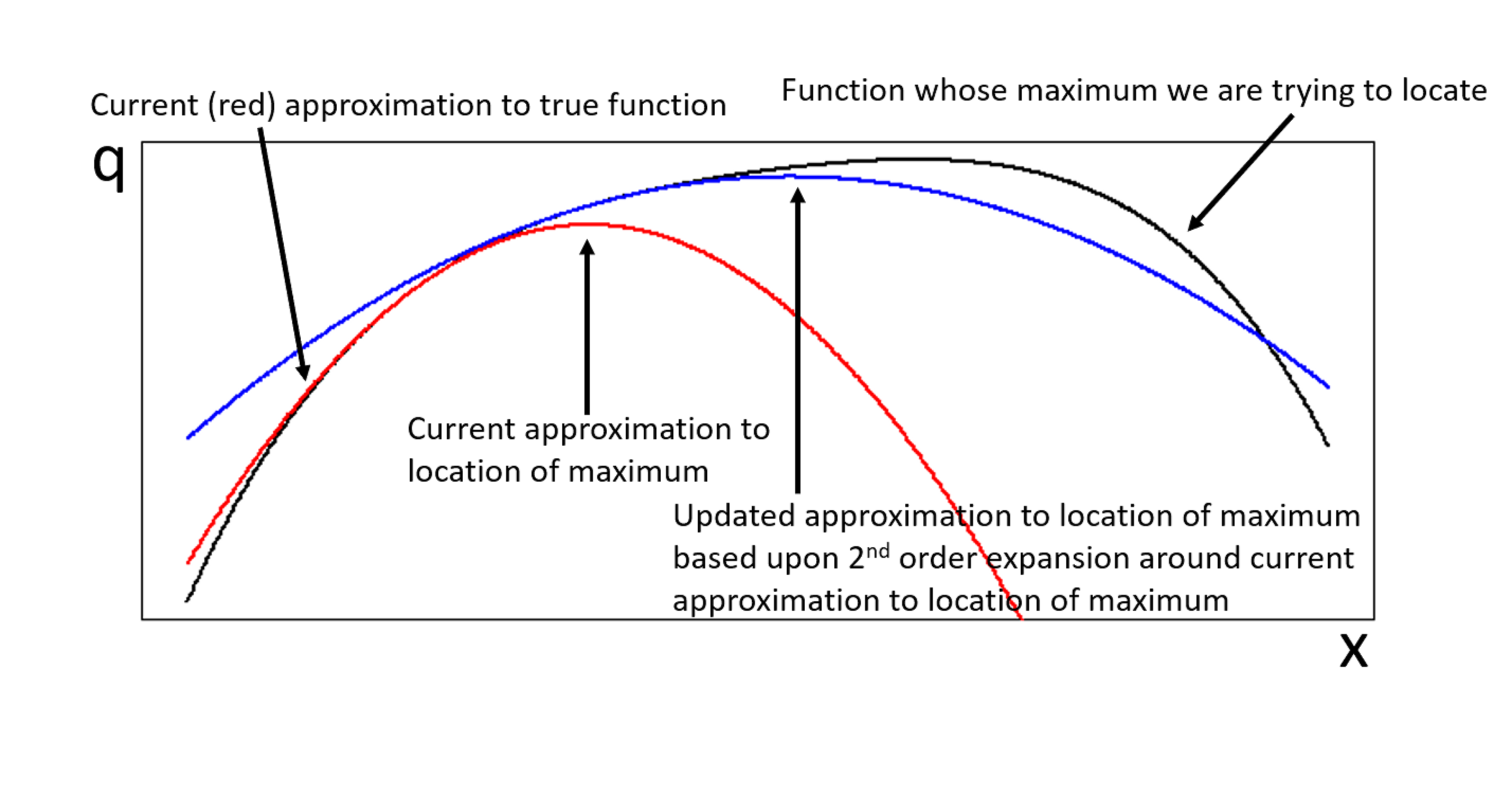
. be the function whose maximum,
  , we are trying to locate. If the expansion of
  of
of 

 of a vector
  is,
is,
 is the Hessian of
 innovations,
  and
and  , this means that each step of the Newton-Raphson procedure would involve the inversion of a
  matrix, i.e. an
  operation for each Newton-Raphson step. However, Seeger et al point out that once we have replaced the log-posterior by a second-order approximation, finding the maximum of that approximation is equivalent to finding the posterior mean of a linear-Gaussian state-space model, and this can be done using Kalman smoothing. This means in each Newton-Raphson step we need only run a Kalman filter calculation, an
  calculation, rather than a Hessian inversion calculation which would be
  is already known within the statistics literature4, but not widely known within machine learning.
 . We consider the signal part of the data is represented by a small number,
  remaining non-zero eigenvalues that correspond to pure noise in the original data.
 , themselves grow with
  , will remain relatively static whilst the noise eigenvalues contribute
  to the total variance. Thus we can see that the fraction of total variance explained by the signal components is essentially,
 is given by,
 forming an orthonormal set.