Summary: If you are using a scatter plot to compare two datasets, rotate your data.
Three times in the last six months I’ve explained to different colleagues and former colleagues what a Bland-Altman (BA) plot is. Admittedly, the last of those explanations was because I remarked to a colleague that I’d been talking about BA-plots and they then wanted to know what they were.
BA-plots are a really simple idea. I like them because they highlight how a human’s ability to perceive patterns in data can be markedly affected by relatively small changes in how that data is presented; rotating the data in this case.
I also like them because they are from the statisticians Martin Bland and Doug Altman who produced a well-known series of short articles, “Statistics Notes”, in the BMJ in the 1990s. Each article focused on a simple, basic, but very important statistical concept. The series ran over nearly 70 articles and the idea was to explain to a medical audience about ‘statistical thinking’. You can find the articles at Martin Bland’s website here. Interestingly, BA-plots were not actually part of this series of BMJ articles as their work on BA-plots had been published in earlier articles. However, I’d still thoroughly recommend having a browse of the BMJ series.
Since I’ve had to explain BA-plots three times recently, I thought I’d give it another go in a blogpost. Also, inspired by the Bland-Altman series, I’m going to attempt a series of 10 or so short blogposts on simple, basic Data Science techniques and concepts that I find useful and/or interesting. The main criterion for inclusion in my series is whether I think I can explain it in a short post, not whether I think it is important.
What is a Bland-Altman plot?
BA-plots are used for comparing similar sets of data. The original use-case was to test how reproducible a process was. Take two samples of data that ideally you would want to be identical and compare them using a BA plot. This could be comparing clinical measurements made by two different clinicians across the same set of patients. What we want to know is how reproducible is a clinical measurement if made by two different clinicians.
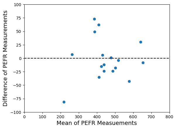
Perhaps the first way of visually comparing two datasets on the same objects would be to just do a scatter plot – one dataset values on the x-axis, the other dataset values on the y-axis. I’ve got an example in the plot below. In fact, I’ve taken this data from Bland and Altman’s original 1986 Lancet paper. You can see the plotted points are pretty close to the 45-degree line (shown as a black dashed line), indicating the two datasets are measuring the same thing with some scatter, perhaps due to measurement error.
Scatter plot of original Bland Altman PEFR data
Now, here’s the neat idea. I can do exactly the same plot, but I’m just going to rotate it clockwise by 45-degrees. A little bit of high-school/college linear algebra will convince you that I can do that by creating two new features,
Here and are our starting features or values from the two datsets we are comparing. Typically, the pre-factors of are omitted and we simply define our new features as,
Now we plot against . I’ve shown the new plot below.
Bland-Altman plot of the PEFR data.
Now a couple of things become clearer. Firstly, is the mean of and and so it gives us a better estimate of any common underlying value than just on its own or on its own. It gives us a good estimate of the size of the ‘thing’ we are interested in. Secondly, is the difference between and . tells us how different and are. Plotting against as I’ve done above shows me how reproducible the measurement is because I can easily see the scale of any discrepancies against the new vertical axis. I also get to see if there is any pattern in the level of discrepancy as the size of the ‘thing’ varies on the new horizontal axis. This was the original motivation for the Bland-Altman plot – to see the level of discrepancy between two sets of measurements as the true underlying value changes.
What the eye doesn’t see
What I really like about BA-plots though, is how much easier I find it to pick out if there is any systematic pattern to the differences between the two datasets. I haven’t looked into the psychological theory of visual perception, but it makes sense to me that humans would find it easier looking for differences as we move our eyes across one dimension – the horizontal axis – compared to moving our eyes across two dimensions – both the horizontal and vertical axes – when trying to scan the 45-degree line.
I first encountered BA-plots 25 years ago in the domain of microarray analysis. In that domain they were referred to as MA-plots (for obvious reasons). The choice of the symbols and also had a logic behind it. and are constructed as linear combinations of and , and in this case we “Add” them when constructing and “Minus” them when constructing . Hence the symbols and even tell you how to calculate the new features. You will also see BA-plots referred to Tukey mean-difference plots (again for obvious reasons).
In microarray analysis we were typically measuring the levels of mRNA gene expression in every gene in an organism across two different environmental conditions. We expected some genes to show differences in expression and so a few data points were expected to show deviations from zero on the vertical -axis. However, we didn’t expect broad systematic differences across all the genes, so we expected a horizontal data cloud on the MA-plot. Any broad systematic deviations from a horizontal data cloud were indicative of a systematic bias in the experimental set-up that needed to be corrected for. The MA plots gave an easy way to both visually detect any bias but also suggested an easy way to correct it. To correct it we just needed to fit a non-linear trendline through the data cloud, say using a non-parametric fit method like lowess. The vertical difference between a datapoint and the trendline was our estimate of the bias-corrected value of for that datapoint.
To illustrate this point I’ve constructed a synthetic example below. The left-hand plot shows the raw data in a standard scatterplot. The scatterplot suggests there is good agreement between the two samples – maybe a bit of disagreement but not much. However, when we look at the same data as a Bland-Altman plot (right-hand plot) we see a different picture. We can clearly see a systematic pattern to the discrepancy between the two samples. I’ve also estimated this systematic variation by fitting a non-linear trendline (in red) using the lowess function in the Python statsmodels package.
Scatterplot and Bland-Altman plot for the second example dataset.
Sometimes we may expect a global systematic shift between our paired data samples, i.e. a constant vertical shift on the axis. Or at least we can explain/interpret such a shift. Or there may be other patterns of shift we can comfortably interpret. This widens the applications domains we can use BA-plots for. In commercial Data Science I’ve seen BA-plots used to assess reproducibility of metrics on TV streaming advertising, and also calibration of transaction data across different supermarket stores. Next time you’re using a vanilla scatterplot to compare two data series, think about rotating and making a BA-plot.
All the code for the examples I’ve given in this post is in the Jupyter notebook DataScienceNotes1_BlandAltmanPlots.ipynb which can be found in the public GitHub repository https://github.com/dchoyle/datascience_notes. Feel free to clone the repository and play with the notebook. I’ll be adding to the repository as I add further “Data Science Notes” blogposts.
Where Data or Data Science is the business model or primary purpose of an organization you can expect data and the data eco-system to be properly invested in. In scientific research and industrial settings this will be common. In the commercial world this is not always the case. As a Data Scientist in the commercial world you should learn to ask, ‘Does this company need data? Does this company actually need Data Science?’ If the answers are not a resounding yes, then beware. Sometimes you won’t be able to answer those questions until you’re up close and inside the organization, but there are indicators that suggest upfront whether an organization is likely to have good quality data and a functioning data eco-system, or whether it will be a pile of trash. In the long read below I outline the different kinds of data I’ve encountered across the commercial and non-commercial sectors I’ve worked in, and what signs I’ve learnt to look for.
Long version
Over 20 years ago, as I was just starting research in the Bioinformatics field, a colleague explained to me the challenges of working with high-throughput biological experimental data. The data, he commented, was typically high-dimensional and very messy. “Messy” was new to me. With a PhD in Theoretical Physics and post-doctoral research in materials modelling, the naïve physicist in me thought, ‘…ah…messy…you mean Gaussian errors with large variance”. I was very wrong.
I learnt that “messy” could mean a high-frequency of missing data, missing meta-data, and mis-labelled data. Sometimes the data could be mis-labelled at source because the original biological material had been mis-labelled – I remember one interesting experience having to persuade my experimental collaborator to go back to the -80°C freezer to check the lung tissue sample because a mis-labelled sample was the only remaining explanation for the anomalous pattern we were seeing in a PCA plot, and yes something had gone wrong in the LIMS because the bar-code associated with the assay data did not match the bar-code on the sample in the freezer.
However, as I moved from the academic sphere into the commercial realm (10 years in the commercial sector now in 2021), I’ve learnt that data errors and issues can be much more varied and challenging, and varies from sector to sector, from domain to domain. BUT…. I have seen that there are broad classes that explain the patterns of data issues I have experienced over 30yrs of mathematical and statistical modelling. In this piece I am going to outline what those broad classes and patterns are, and more importantly how to recognize when they are likely to arise. The broad classes of data are,
Scientific or Experimental – here, data is collected for the purposes of being analysed, and so therefore is optimized towards those purposes.
Sensor data – here, data is collected for the purposes of detecting signals, possibly diagnostic, i.e., working out what the cause of a problem is, or being monitored, i.e., detecting a problem in the first place. It is intended primarily to be automatically monitored/processed, but not necessarily analysed by a human (Data Scientist) in the loop. The data lends itself to large-scale analysis but may not be in a form that is optimal or friendly for doing data science.
Commercial operational data – this is data that is stored, rather than actively collected. It is stored, usually initially on a temporary (short-term), for the purposes of running the business. It could be server event data from applications supporting online platforms or retail sites, or customer transaction data, Google ad-click data, marketing spend data, or financial data.
It is this last category that is perhaps the most interesting – quite obviously if you are a Data Scientist working in a commercial sector. For commercial operational data, not only can the data contain the usual errors but there can be a range of additional challenges – columns/fields in tables containing completely different data than they are supposed to because a field has been over-loaded, or re-purposed for a different need without going through a modification/re-design of the schema. Without an accurate updated data-dictionary, this knowledge about the true content of the fields in a table resides as, ‘folk knowledge’ in the heads of the longer serving members of staff – until they leave the company, and that knowledge is lost.
I have my own favourite stories about data issues I have encountered in various organizations I have worked for – such as the time I worked with some server-side event data whose unique id for each event turned out only to be unique for a day, because the original developer didn’t think anyone would be interested in the data beyond a day.
Every commercial data scientist will be able to tell similar ‘war stories’, often exchanged over a few beers with colleagues after work. Such war stories will not go away any time soon. The more important point is how do we recognize the situations where they are more likely to occur? The contrast I have already highlighted above, between the different classes of data, gives us a clue – where data is not seen as the most valuable part of the process, nor the primary purpose of the process, it will be relatively less invested in and typically of lower quality.
For example, in the first two categories, and in the scientific realm in particular, data is generated with the idea, from the outset, that it is a valuable asset; the data is often the end itself. For example, the data collected from a scientific experiment provides the basis for scientific insight and discoveries, and potentially future IP; the data collected to monitor complex technical systems saves operating costs by minimizing downtime of those systems and potentially identifying improved efficiencies. Poor quality data, or inadequate systems for handling data has an immediate and often critical impact upon the primary goal of the organization or project, and so there is an immediate incentive to rectify errors and data quality issues and to invest in systems that enable efficient capture and processing of the data.
Some commercial organizations also effectively fall into these first two classes. For companies where the data and/or data science is the product from the outset, or the potential value of a data stream has been realized early on, then there is an incentive to invest in efficient and effective data eco-systems, with the consequence benefit in terms of data quality – if sufficient investment in data and data systems is not made, a company whose main revenue stream is the data will quickly go out of business.
In contrast, for most commercial organizations, the potential value of commercial data may be secondary to its original purpose, and so data quality from the perspective of these secondary uses may be poor, even if the value or future revenue streams attached to these secondary uses may be much greater than the original primary use of the data. For such companies, the general importance of data may be recognized, but that does not mean that data eco-systems are getting the right sort of investment. For example, for a company providing a B2C platform, data on the behaviour of consumers can provide potentially actionable and important insight, but ultimately it is the platform itself (and its continued operation 24/7) that is of prime importance. Similarly, for an online retail site, the primary concern is volume of transactions and shipping. Consequently, for these organizations the data issues that arise are richer, more colorful, and often more challenging. This is because poor quality data and systems do not immediately threaten the viability of the business, or main revenue streams. Long-term, yes, there will be an impact upon UX and overall consumer satisfaction, but many operations are happy to take that hit and counter it by attempting to increase transaction volume.
For these organizations it may be recognized that data is important enough for capital to be spent on data eco-systems, but that capital investment may be poorly thought through or not joined-up. Again, there are several symptoms I have learnt to recognize as red flags. Dividing these into symptoms related to strategy and tactical related symptoms, they are,
Strategy related symptoms:
Lack of a Data Strategy. The value of data, even the potential of value has not been recognized or realistically thought through. Consequently, there is unlikely to be any strategy underpinning the design of the data eco-system.
Any ‘strategy’ is at best aspirational, being driven top-down by an Exec. The capital investment is there, but no joined up plan. The organization sets up a Data Science function because other organizations are – typified by hiring of a ‘trophy Data Scientist’. Dig deeper and you will find no real pull from the business areas for a Data Science function. Business areas have been sold Data Science as a panacea, so have superficially bought into the aspirational strategy – who in a business function would not agree when told that the new junior Data Science hires will analyse the poorly curated or non-existent data and will come up with new product ideas that have a perfect market fit and will be coded into a fully productionized model. I have seen product owners who have been sold a vision and believe that they can now just put their feet up because the new Data Scientist will do it all.
The organization cannot really articulate why it needs a Data Science function when asked – this is one of my favourites. Asking ‘why’ here is the equivalent of applying the ‘Five Whys’ technique at the enterprise-level rather than at a project-level. Many companies may respond to the question with the cliched answer, ‘because we want to understand our customers better, which will help us be more profitable’. Ok, but where are the examples of when not understanding this particular aspect your customers has actually hurt the business. If there is no answer given, you know that the need for an machine learning based solution to this task is perceived rather than evidenced.
A mentality exists that data is solely for processing/transacting, not analysing – hence there is little investment in analytics platforms and tooling, resulting in significant friction in getting analytics tooling close to data (or vice-versa). Possibly there is not even a recognition that there is distinction between analytics systems and reporting systems. Business areas may believe that only data querying skills and capability are needed, so the idea that you want to make building of predictive models as frictionless as possible for the Data Science team, is an alien one.
Lack of balance in investments between Data Engineering and Data Science – this is not optimal whichever function gets the bigger share of the funding. This is often mirrored by a lack of linking up between the Data Science team and the Data Engineering team, sometimes resulting in open hostility between the two.
Lack of Data Literacy in business area owners or product owners. Despite this, organizations often have a belief that they will be able to roll-out a ‘self-serve’ analytics solution across the enterprise that will somehow deliver magical business gains.
Tactical related symptoms:
Users in business areas are hacking together processes, which then take on a life of their own. This leads to multiple conflicting solutions, most of which are very fragile, and some of which get re-invented multiple times.
Business and product owners ask for Data Science/Machine Learning driven solutions but can’t answer how they are going to consume the outputs of the solution.
The analytics function, whether ad-hoc or formal, primarily focuses on getting the numbers ready for the month-end report. These numbers are then only briefly discussed, or ignored by senior management, because they conflict with data from other ad-hoc reports built from other internal data sources, or they are too volatile to be credible, or they conflict with the prior beliefs of senior management.
Business and product owners consider it acceptable/normal to use a Data Analyst or Data Scientist for, ‘can you just pull this data for me’ tasks.
As a Data Scientists what can you do if you find yourself in a scenario where these symptoms arise? There are two potential ways to approach this,
How do we respond to it – what can we do reactively? Flag it up – complain when systems don’t work and highlight when it they do. Confession here – I’ve not always been good at complaining myself, so this is definitely a case of me recognizing what I should have done, not what I did. On the less political front, you can try and always construct your analytical processes to minimize the impact of any upstream processes not under your control. By this I mean making downstream analysis pipelines more robust by building in automated checks for data quality and domain specific consistency. Where this is not possible, then stop or refuse to work on those processes that are so impacted as to be worthless. This last point is about making others share in your pain or shifting/transferring the pain elsewhere – onto business/product owners, from insight to operational teams. If other teams also experience the pain of poor-quality data, or poorly designed data-ecosystems and analytical platforms, then they have an incentive to help you try and fix the issues. Again, on a less political front, make sure expectations take into account the reality of what you have to deal with. Get realistic SLAs re-negotiated/agreed that reflect the reality of the data you are having to work with – this will protect you and highlight what could be done if the data were better.
How can we prevent it – what can we do proactively? The most effective way for any organization to avoid such issues is to have a clear and joined up Data Strategy and Analytics Strategy. It is important for an organization to recognize that having a Data Strategy does not mean it has an Analytics Strategy. Better still, an organization should have a clear understanding of what informed decisions underpin the future operations of its business model. Understanding this will drive/focus the identification of the correct data needed to support those decisions and hence will naturally lead (via pull) to investment in high-quality data capture processes and efficient data engineering/data analysis infrastructure. Formulating the Data Strategy may not formally be part of your brief, but it is likely that, as a Data Scientist and therefore end-user, you can influence it. This is particularly important in order to make sure that the analytical capability is a first-class and integrated citizen of any Data Strategy. This can be done by giving examples of the cost/pain when it is not so. Very often, a CDO or CTO formulating the Data Strategy will come from an Engineering background and so the Data Strategy will be biased towards Ops. Any awareness of a need for the Data Strategy to support analytics will be focused on near-term analytics, e.g., supporting real-time reporting capabilities. The need to for the Data Strategy to support future Ops by supporting insight, innovation and discovery capabilities may be omitted. If a Data Science function is considered, it will be as a bolt-on – possibly a well-funded Data Science bolt-on, but still a bolt-on.