TL;DR: Both Principal Components Analysis (PCA) and Minor Components Analysis (MCA) can be used for dimensionality reduction, identifying low-dimensional subspaces of interest as those which have the greatest variation in the original data (PCA), or those which have the least variation in the origina data MCA). As real data will contain both directions of unusually high variance and directions of unusually low variance, using just PCA or just MCA will lead to biased estimates of the low-dimensional subspace. The 2003 NeurIPs paper from Welling et al unifies PCA and MCA into a single probabilistic model XCA (Extreme Components Analysis). This post explains the XCA paper of Welling et al and demonstrates the XCA algorithm using simulated data. Code for the demonstration is available from https://github.com/dchoyle/xca_post
A deadline
This post arose because of a deadline I have to meet. I don’t know when the deadline is, I just know there is a deadline. Okay, it is a self-imposed deadline, but it will start to become embarrassing if I don’t hit it.
I was chatting with a connection, Will Faithfull, at a PyData Manchester Leaders meeting almost a year ago. I mentioned that one of my areas of expertise was Principal Components Analysis (PCA), or more specifically, the use of Random Matrix Theory to study the behaviour of PCA when applied to high-dimensional data.
A recap of PCA
In PCA we are trying to approximate a d-dimensional dataset by a reduced number of dimensions  . Obviously we want to retain as much of the structure and variation of the original data, so we choose our k-dimensional subspace such that the variance of the original data in the subspace is as high as possible. Given a mean-centered data matrix
  consisting of
  observations, we can calculate the sample covariance matrix
  as 1,
as 1,

Once we have the (symmetric) matrix we can easily compute its eigenvectors  , and their corresponding eigenvalues
  .
.
The optimal  -dimensional PCA subspace is then spanned by the eigenvectors of that correspond to the largest eigenvalues of . These eigenvectors are the directions of greatest variance in the original data. Alternatively, one can just do a Singular Value Decomposition (SVD) of the original data matrix , and work with the singular values of instead of the eigenvalues of .
That is a heuristic derivation/justification of PCA (minus the detailed maths) that goes back to Harold Hotelling in 19332. There is a probabilistic model-based derivation due to Tipping and Bishop (1999), which we will return to later.
MCA
Will responded that as part of his PhD, he’d worked on a problem where he was more interested in the directions in the dataset along which the variation is least. The problem Will was working on was “unsupervised change detection in multivariate streaming data”. The solution Will developed was a modular one, chaining together several univariate change detection methods each of which monitored a single feature of the input space. This was combined with a MCA feature extraction and selection pre-processing step. The solution was tested against a problem of unsupervised endogenous eye blink detection.
The idea behind Will’s use of MCA was that for the streaming data he was interested in it was likely that the inter-class variances of various features were likely to be much smaller than intra-class variances, and so any principal components were likely to be dominated by what the classes had in common rather than what had changed, so the directions of greatest variance weren’t very useful for his change detection algorithm.
I’ve put a link here to Will’s PhD in case you are interested in the details of the problem and solution – yes, Will I have read your PhD.
Directions of least variance in a dataset can be found from the same eigen-decomposition of the sample covariance matrix and by selecting the components with the smallest non-zero eigenvalues. Unsurprisingly, focusing on directions of least variance in a dataset is called Minor Components Analysis (MCA)3,4. Where we have the least variation in the data the data is effectively constrained so, MCA is good for identifying/modelling invariants or constraints within a dataset.
At this point in the conversation, I recalled the last time I’d thought about MCA. That was when an academic colleague and I had a paper accepted at the NeurIPs conference in 2003. Our paper was on kernel PCA applied to high-dimensional data, in particular the eigenvalue distributions that result. As I was moving job and house at the time I was unable to go the conference, so my co-author, Magnus Rattray (now Director of the Institute for Data Science and Artificial Intelligence at the University of Manchester), went instead. On returning, Magnus told me of an interesting conversation he’d had at the conference with Max Welling about our paper. Max also had a paper at the conference, on XCA – Extreme Components Analysis. Max and his collaborators had managed to unify PCA and MCA into a single framework.
I mentioned the XCA paper to Will at the PyData Manchester Leaders meeting and said I’d write something up explaining XCA. It would also give me an excuse to revisit something that I hadn’t looked at since 2003. That conversation with Will was nearly a year ago. Another PyData Manchester Leaders meeting came and went and another will be coming around sometime soon. To avoid having to give a lame apology I thought it was about time I wrote this post.
XCA
Welling et al rightly point out that if we are modelling a dataset as lying in some reduced dimensionality subspace then we consider the data as being a combination of variation and constraint. We have variation of the data within a subspace and a constraint that the data does not fall outside the subspace. So we can model the same dataset focusing either on the variation (PCA) or on the constraints (MCA).
Note that in my blog post I have used a different, more commonly used notation. for the number of features and the number of components, than that used in the Welling et al paper. The mapping between the two notations is given below,
- Number of features: My notation =
 , Welling et al notation =
- Number of components: My notation = , Welling et al notation =
Probabilistic PCA and MCA
PCA and MCA both have probabilistic formulations, PPCA and PMCA5 respectively. Welling et al state that, “probabilistic PCA can be interpreted as a low variance data cloud which has been stretched in certain directions. Probabilistic MCA on the other hand can be thought of as a large variance data cloud which has been pushed inward in certain directions.” In both probabilistic models a -dimensional datapoint  is considered as coming from a zero-mean multivariate Gaussian distribution. In PCA the covariance matrix of the Gaussian is modelled as,

The matrix  is
is  and its columns are the principal components that span the low dimensional subspace we are trying to model.
In MCA the covariance matrix is modelled as,

The matrix  is
is  and its rows are the minor components that define the
  subspace where we want as little variation as possible.
Since in real data we probably have both exceptional directions whose variance is greater than the bulk and exceptional directions whose variance is less than the bulk, both PCA and MCA would lead to biased estimates for these datasets. The problem is that if we use PCA we lump the low variation eigenvalues (minor components) in with our estimate of the isotropic noise, thereby underestimating the true noise variance and consequently biasing our estimate of the large variation PC subspace. Likewise, if we use MCA, we lump all the large variation eigenvalues (principal components) into our estimate of the noise and overestimate the true noise variance, thereby biasing our estimate of the low variation MC subspace.
Probabilistic XCA
In XCA we don’t have that problem. In XCA we include both large variation and small variation directions in our reduced dimensionality subspace. In fact we just have a set of orthogonal directions  that span a low-dimensional subspace and again form the columns of a matrix . These are our directions of interest in the data. Some of them, say,
  , have unusually large variance, some of them, say
  , have unusually small variance. The overall number of extreme components (XC) is
  .
.
As with probabilistic PCA, we then add on top an isotropic noise component to the overall covariance matrix. However, the clever trick used by Welling et al was that they realized that adding noise always increases variances, and so adding noise to all features will make the minor components undetectable as the minor components have, by definition, variances below that of the bulk noise. To circumvent this, Welling et al only added noise to the subspace orthogonal to the subspace spanned by the vectors  . They do this by introducing a projection operator
  . Again we model the data as coming from a zero-mean multivariate Gaussian, but for XCA the final covariance matrix is then of the form,

and the XCA model is,

We can also start from the MCA side, by defining a projection operator  , where the rows of the
  matrix span the dimensional XC subspace we wish to identify. From this MCA-based approach Welling et al derive the probabilistic model for XCA as zero-mean multivariate Gaussian distribution with inverse covariance,

The two probabilistic forms of XCA are equivalent and so one finds that the matrices and are related via 
If we also look at the two ways in which Welling et al derived a probabilistic model for XCA, we can see that they are very similar to the formulations of PPCA and PMCA respectively, just with the replacement of  for
for  in the PPCA formulation, and the replacement of
  for in the PMCA formulation. So with just a redefinition of how we add the noise in the probabilistic model, Welling et al derived a single probabilistic model that unifies PCA and MCA.
Note that we are now defining the minor components subspace as directions of unusually low variance, so we only need a few dimensions, i.e.  , whilst previously when we defined the minor components subspace as the subspace where we wanted to constrain the data away from, we needed
  directions. The probabilistic formulation of XCA is a very natural and efficient way to express MCA.
Maximum Likelihood solution for XCA
The model likelihood is easily written down and the maximum likelihood solution identified. As one might anticipate the maximum-likelihood estimates for the vectors are just eigenvectors of  , but we need to work out which ones. We can use the likelihood value at the maximum likelihood solution to do that for us.
Let’s say we want to retain  extreme components overall, and we’ll use
  to denote the corresponding set of eigenvalues of that are retained. The maximum likelihood value for extreme components (XC) is given by,
![\log L_{ML} = - \frac{Nd}{2}\log \left ( 2\pi e\right )\;-\;\frac{N}{2}\sum_{i\in {\cal{C}}}\lambda_{i}\;-\;\frac{N(d-k)}{2}\log \left ( \frac{1}{d-k}\left [ {\rm tr}\hat{\underline{\underline{C}}} - \sum_{i\in {\cal{C}}} \lambda_{i}\right ]\right )](https://s0.wp.com/latex.php?latex=%5Clog+L_%7BML%7D+%3D+-+%5Cfrac%7BNd%7D%7B2%7D%5Clog+%5Cleft+%28+2%5Cpi+e%5Cright+%29%5C%3B-%5C%3B%5Cfrac%7BN%7D%7B2%7D%5Csum_%7Bi%5Cin+%7B%5Ccal%7BC%7D%7D%7D%5Clambda_%7Bi%7D%5C%3B-%5C%3B%5Cfrac%7BN%28d-k%29%7D%7B2%7D%5Clog+%5Cleft+%28+%5Cfrac%7B1%7D%7Bd-k%7D%5Cleft+%5B+%7B%5Crm+tr%7D%5Chat%7B%5Cunderline%7B%5Cunderline%7BC%7D%7D%7D+-+%5Csum_%7Bi%5Cin+%7B%5Ccal%7BC%7D%7D%7D+%5Clambda_%7Bi%7D%5Cright+%5D%5Cright+%29&bg=ffffff&fg=111111&s=0&c=20201002)
All we need to do is evaluate the above equation for all possible subsets of size selected from the eigenvalues  of . Superificially, this looks like a nasty combinatorial optimization problem, of exponential complexity. But as Welling et al point out, we know from a result proved in the PPCA paper of Tipping and Bishop that in the maximum likelihood solution the non-extreme components have eigenvalues that form a contiguous group, and so the optimal choice of subset reduces to determining where to split the ordered eigenvalue spectrum of . Since we have that reduces to simply determining the optimal number of the largest to retain. That makes the optimization problem linear in .
For example, in our hypothetical example we have said we want  , but that could be a 3 PCs + 3 MCs split, or a 2 PCs + 4MCs split, and so on. To determine which we simply compute the maxium likelihood value for all the possible values of from
  to
to  , each time keeping the largest values of and the smallest
  values of in our set .
Some of the terms in  don’t change as we vary and can be dropped. Welling et al introduce a quantity
  defined by,

is the negative of , up to an irrelevant constant and scale. If we then compute  for all values of to and select the minimum, we can determine the optimal split of .
PCA and MCA as special cases
Potentially, we could find that , in which case all the selected extreme components would correspond to principal components, and so the XCA algorithm becomes equivalent to PCA. Likewise, we could get , in which case all the selected extreme components would correspond to minor components and the XCA algorithm becomes equivalent to MCA. So XCA contains pure PCA and pure MCA as special cases. But when do these special cases arise? Obviously, it will depend upon the precise values of the sample covariance eigenvalues , or rather the shape of the eigen-spectrum, but Welling et al also give some insight here, namely,
- A log-convex sample covariance eigen-spectrum will give PCA
- A log-concave sample covariance eigen-spectrum will give MCA
- A sample covariance eigen-spectrum that is neither log-convex nor log-concave will yield both principal components and minor components
In layman’s terms, if the plot of the (sorted) eigenvalues on a log scale only bends upwards (has positive second derivative) then XCA will give just principal components, whilst if the plot of the (sorted) eigenvalues on a log scale only bends downwards (has negative second derivative) then we’ll get just minor components. If the plot of the log-eigenvalues has places where the second derivative is positive and places where it is negative, then XCA will yield a mixture of principal and minor components.
Experimental demonstration
To illustrate the XCA theory I produced a Jupyter notebook that generates simulated data containing a known number of principal components and a known number of minor components. The simulated data is drawn from a zero-mean multivariate Gaussian distribution with population covariance matrix  whose eigenvalues
  have been set to the following values,

The first eigenvalues represent principal components, as their variance is considerable higher than the ‘noise’ eigenvalues, which are represented by eigenvalues  to
to  . The last eigenvalues represent minor components, as their variance is considerably lower than the ‘noise’ eigenvalues. Note, I have scaled both the PC and MC population eigenvalues by the ‘noise’ variance
  , so that just sets an arbitrary (user-chosen) scale for all the variances. I have chosen a large value of
  , so that when I plot the minor component eigenvalues of I can easily distinguish them from zero (without having to plot on a logarithmic scale).
We would expect the eigenvalues of the sample covariance matrix to follow a similar pattern to the eigenvalues of the population covariance matrix that we used to generate the data, i.e. we expect a small group of noticeably low-valued eigenvalues, a small group of noticeably high-valued eigenvalues, and the bulk (majority) of the eigenvalues to form a continuous spectrum of values.
I generated a dataset consisting of  datapoints, each with
  features. For this dataset I chose
  . From the simulated data I computed the sample covariance matrix and then calculated the eigenvalues of .
The left-hand plot below shows all the eigenvalues (sorted from lowest to highest), and I have also zoomed in on just the smallest values (middle plot) and just the largest values (right-hand plot). We can clearly see that the sample covariance eigenvalues follow the pattern we expected.
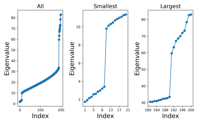
All the code (with explanations) for my calculations are in a Jupyter notebook and freely available from the github repository https://github.com/dchoyle/xca_post
From the left-hand plot we can see that there are places where the sample covariance eigenspectrum bends upwards and places where it bends downwards, indicating that we would expect the XCA algorithm to retain both principal and minor components. In fact, we can clearly see from the middle and right-hand plots the distinct group of minor component eigenvalues and the distinct group of principal component eigenvalues, and how these correspond to the distinct groups of extreme components in the population covariance eigenvalues. However, it would be interesting to see how the XCA algorithm performs in selecting a value for the number of principal components.
For the eigenvalues above I have calculated the minimum value of for a total of  extreme components. The minimum value of occurs at
  , indicating that the method of Welling et al estimates that there are 10 principal components in this dataset, and by definition there are then
  minor components in the dataset. In this case, the XCA algorithm has identified the dimensionalities of the PC and MC subspaces exactly.
Final comments
That is the post done. I can look Will in the eye when we meet for a beer at the next PyData Manchester Leaders meeting. The post ended up being longer (and more fun) than I expected, and you may have got the impression from my post that the Welling et al paper has completely solved the problem of selecting interesting low-dimensional subspaces in Gaussian distributed data. Note quite true. There are still challenges with XCA, as there are with PCA. For example, we have not said how we choose the total number of extreme components . That is a whole other model selection problem and one that is particularly interesting for PCA when we have high-dimensional data. This is one of my research areas – see for example my JMLR paper Hoyle2008.
Another challenge that is particularly relevant for high-dimensional data is the question of whether we will see distinct groups of principal and minor component sample covariance eigenvalues at all, even when we have distinct groups of population covariance eigenvalues. I chose very carefully the settings used to generate the simulated data in the example above. I ensured that we had many more samples than features, i.e.  , and that the extreme component population covariance eigenvalues were distinctly different from the ‘noise’ population eigenvalues. This ensured that the sample covariance eigenvalues separated into three clearly visible groups.
However, in PCA when we have  and/or weak signal strengths for the extreme components of the population covariance, then the extreme component sample covariance eigenvalues may not be separated from the bulk of the other eigenvalues. As we increase the ratio
  we observe a series of phase transitions at which each of the extreme components becomes detectable – again this is another of my areas of research expertise [HoyleRattray2003, HoyleRattray2004, HoyleRattray2007]
Footnotes
- I have used the usual divide by
 Bessel correction in the definition of the sample covariance. This is because I have assumed any data matrix will have been explicitly mean-centered. In many of the analyses of PCA the starting assumption is that the data is drawn from a mean-zero distribution, so that the sample mean of any feature is zero only under expectation, not as a constraint. Consequently, most formal analysis of PCA will define the sample covariance matrix with a
  factor. Since I have to deal with real data, I will never presume the data been drawn from population distribution that has zero-mean and so to model the data with a zero-mean distribution I will explicitly mean-center the data. Therefore, I use the
  definition of the sample covariance. Strictly speaking, that means the various theories and analyses I discuss later in the post are not applicable to the data I’ll work with. It is possible to modify the various analyses to explicitly take into account the mean-centering step, but it is tedious to do so. In practice, (for large ) the difference is largely inconsequential, and formulae derived from analysis of zero-mean distributed data can be accurate for mean-centered data, so we’ll stick with using the definition for .
-
Hotelling, H. “Analysis of a complex of statistical variables into principal components”. Journal of Educational Psychology, 24:417-441 and also 24:498–520, 1933.
https://dx.doi.org/10.1037/h0071325
-
Oja, E. “Principal components, minor components, and linear neural networks”. Neural Networks, 5(6):927-935, 1992. https://doi.org/10.1016/S0893-6080(05)80089-9
-
Luo, F.-L., Unbehauen, R. and Cichocki, A. “A Minor Component Analysis Algorithm”. Neural Networks, 10(2):291-297, 1997. https://doi.org/10.1016/S0893-6080(96)00063-9
-
See for example, Williams, C.K.I. and Agakov, F.V. “Products of gaussians and probabilistic minor components analysis”. Neural Computation, 14(5):1169-1182, 2002. https://doi.org/10.1162/089976602753633439
© 2025 David Hoyle. All Rights Reserved


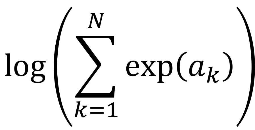
 . This calculation is called log-sum-exp.
 function.
 , where you have values for the
  . Really? Will you? Yes, it will probably be calculating a log-likelihood, or a contribution to a log-likelihood, so the actual calculation you want to do is of the form,
 and
and  and
and  to
to  we are using floating point arithmetic to try and add a very large number to a much smaller number. Most likely we will get an overflow error. If would be much better if we’d started with
  , which would be very negative and from this we could easily infer that adding
  by
by  and computes an accurate approximation to
  without encountering underflow or overflow errors.
![a = [a_{1}, a_{2}, \ldots, a_{N}]](https://s0.wp.com/latex.php?latex=a+%3D+%5Ba_%7B1%7D%2C+a_%7B2%7D%2C+%5Cldots%2C+a_%7BN%7D%5D&bg=ffffff&fg=111111&s=0&c=20201002) . Let’s say, without loss of generality, the maximum value is
. Let’s say, without loss of generality, the maximum value is 
 are all negative for
  , so we can easily approximate the logarithm on the right-hand side of the equation by a suitable expansion of
  . This is the “log-sum-exp” trick.

 , it is also relatively easy to show that,

 are allowed to be negative. This means, that when we are using the SciPy log-sum-exp function to perform the log-sum-exp trick, we can actually use it to calculate numerically stable estimates of sums of the form,
 .
. . This is because the first two contributions,
  .
.


 and
and  are our starting features or values from the two datsets we are comparing. Typically, the pre-factors of
  are omitted and we simply define our new features as,

 against
  . I’ve shown the new plot below.


![\rm{[currency]}^{-1}](https://s0.wp.com/latex.php?latex=%5Crm%7B%5Bcurrency%5D%7D%5E%7B-1%7D&bg=ffffff&fg=111111&s=0&c=20201002) , then so must the left-hand side. Similarly, arguments to transcendental functions such as exp or sin and cos must be dimensionless. These checks are a quick and easy way to spot if a formula is inadvertently missing a dimensionful factor.
, then so must the left-hand side. Similarly, arguments to transcendental functions such as exp or sin and cos must be dimensionless. These checks are a quick and easy way to spot if a formula is inadvertently missing a dimensionful factor.


![[x_{lower}, x_{upper}]](https://s0.wp.com/latex.php?latex=%5Bx_%7Blower%7D%2C+x_%7Bupper%7D%5D&bg=ffffff&fg=111111&s=0&c=20201002) , which has width
, which has width  , to knowing it is in an interval of width
  . So with every iteration we reduce our uncertainty of where the root is located by half. After
  . Given our initial uncertainty is determined by the initial bracketing of the root, i.e. an interval of width
  , we can now work out that after
  . Now if we want to locate the root to within a tolerance
  , we just have to keep iterating until the uncertainty reaches
 iterations. Usually I will add on a few extra iterations, e.g. 3 to 5, as an engineering safety factor.
 of one of those outcomes, then the question that has
  maximizes the expected information (the entropy),
  .
. along the current interval, meaning the cut-point is
  . At each iteration we don’t know in advance which side of the cut-point the root lies until we test for it, so in trying to determine in advance the number of iterations we need to run, we have to assume the worst case scenario and assume that the root is still in the larger of the two intervals. The reduction in uncertainty is then,
  . Repeating the derivation we find that we have to run at least,
 .
.

 is at
is at  , although
  is not a stationary point of the upper bound
  with
with  in all the above formula. That is, in the best-case scenario the number of iterations required is given by,
 .
.  with probability
 plotted against
 . Also plotted in Figure 2 are our three theoretical estimates,
  . The stepped structure in these 3 integer quantities is clearly apparent, as is how many more iterations are required under the worst case method when
  .
. , actually shows a rich structure that isn’t clear unless you zoom in. Some aspects of that structure were unexpected, but requires some more involved mathematics to understand. I may save that for a follow-up post at a later date.